Your designs get better with time as you practice and experiment with different color schemes, typography, themes, and layouts. But, let’s not forget the days of discarding hundreds of designs and almost giving up on our designing skills. Don’t worry, we’ve all been there. Honestly, I still sometimes second guess my designs because something just doesn’t seem right. Ugh.
By now you know that designing goes beyond shapes and colors. It is about delivering the desired messages effectively through aesthetically pleasing designs. The sad news is that every design has its own requirement and you can’t really apply one process every time.
Years of designing experience and I can finally say that I have some cheat codes that are my life-savers. I am sharing them with my kindred designers!
- Separate Groups with Adequate Spaces
Clustered text and pictures are a major turnoff. Good designs emphasize important areas while keeping the rest subtle. However, when everything is grouped together, one’s attention wobbles around and fails to stimulate desired actions.
The screenshot from Gulf News shows adequate space between the headline and the writer’s name and date on which the article was published. A proper hierarchy of data is evident, with relevant information grouped together.
It’s easier to read and interpret and requires no effort to find information. You simply know where to look.
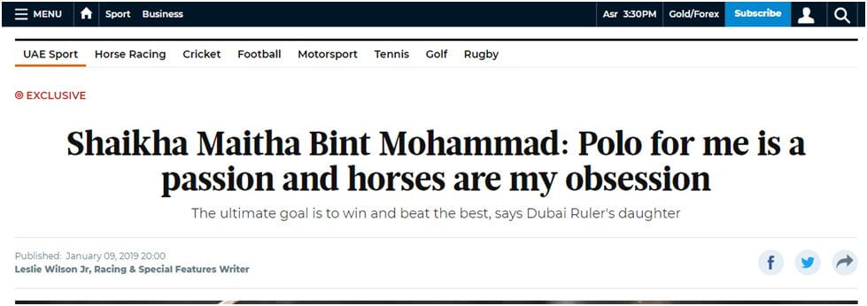
Tip: 24px is a good space between two groups
‘Whitespace is like air: it is necessary for the design to breathe’ – Wojciech Zielinski
- Look for Better Contrast, Not Bigger Font
Bold font, bigger font size, and boom, you’re good to go? NOPE.
Text hierarchy isn’t only about different sizes, but about the right contrast between texts of varying significance.
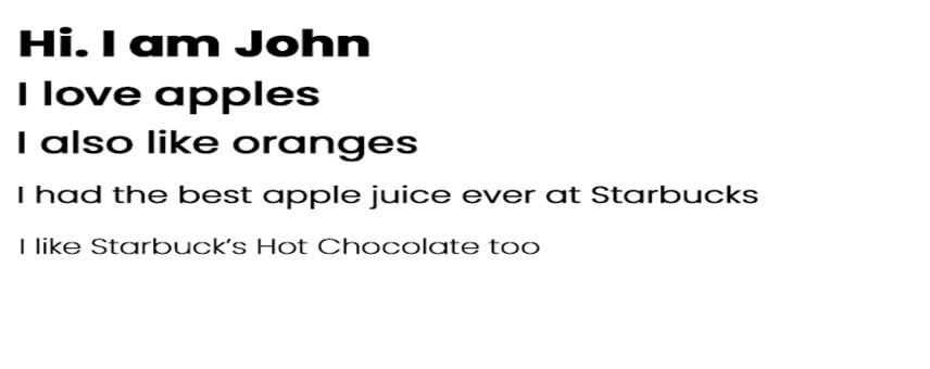
So yes, text size isn’t the only key. Instead, you need a balance of size, colors, and weights. Look at the example below.
The screenshot from The New York Times shows varying sizes, colors, and weights, creating the right contrast. Your eyes unconsciously stop at the headline without it being overly bold. The color hierarchy is balanced efficiently.
- Develop a Pattern and be Consistent
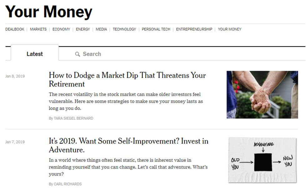
Consistency is the key to creating memorable designs. All top-notch websites follow their respective design patterns for all their content. For example, all news articles on CNN have the same font style for headings and body. The author’s name and publishing date are published at the same place for all articles. This not only makes it easier for readers but saves the time of the designing team as well.
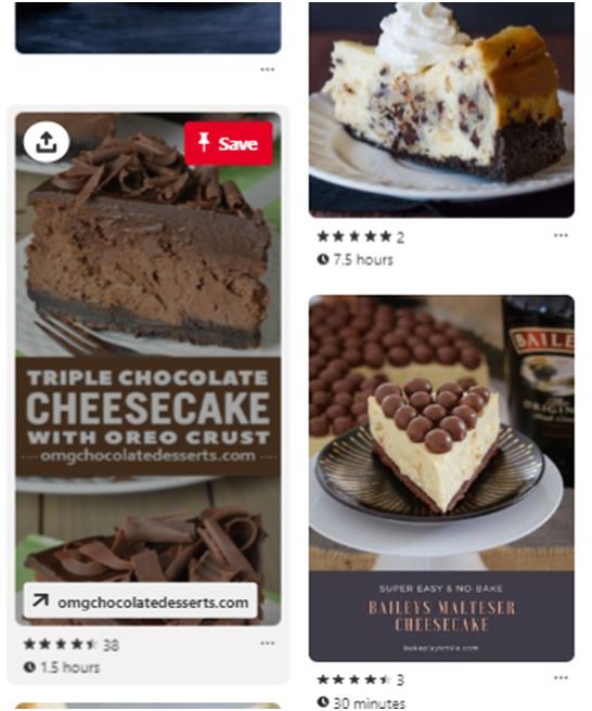
Search for best cheesecakes on Pinterest and every picture will have the preparation time at the bottom so you know where to look.
- Keep the Text Lines Short
Longer lines to fill in the empty space? Not a good idea.
It’s completely alright to have some white space around the text, instead of straining the readers’ eyes with long lines. It reduces the readability and requires extra effort to read the lines till the end.
You can center-align the text to get comfortable

Tip: Keep the characters between 50-60 characters per line
- Set the Bullets Aside
The rule is simple. The bullets remain on the other side of the margin. The idea of bullets is to enhance readability by summarizing content. Hence, the bullets must stay in the margin.
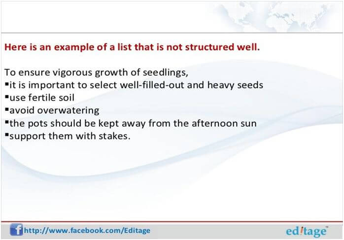
(Source: SlideShare)
The picture above kills the purpose of bullets and lists. The bullets are glued to the content and the readability is low.
Have a look at the picture to know the difference it makes.
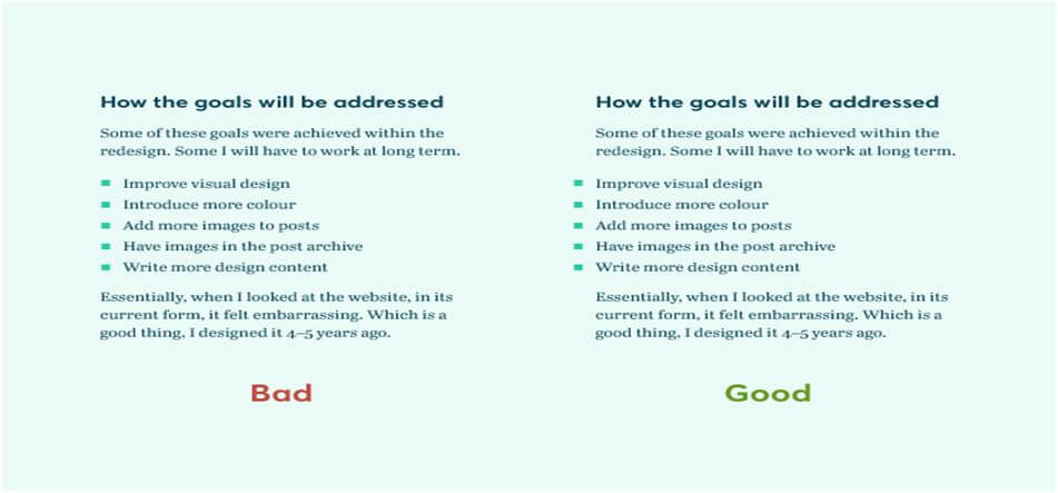
(Source: iamsteve)
- Instead of Borders, Try Different Background Colors
Borders are common distinguishers between elements. However, you must try using different background colors to distinguish adjacent elements.
Tip: Remove the border when using different background colors
- Go Easy on the Icon Size
People are familiar with some icons, so no need to place them in larger sizes. For example, the icons for email and phone calls are self-explanatory followed by email addresses and phone numbers.
Also, images of 16-24px lose their precision when increased in size. Don’t play with the icon quality to fit it into the desired size. Instead, enclose it in a circle. This will fill the space and add a background color to the icon.
![]()
- Play with Black’s Opacity
Black text isn’t the best choice as it causes eye strainers. You must use darker variants but choosing a range of color values is time-consuming and an unnecessary effort that you can avoid.
Choose the black color (#000) and play with the opacity to find the right color. Decrease the opacity of (#000) and choose a shade that best fits primary, secondary, or other content.
- Don’t Add Background Colors to All Buttons
Not all buttons need a background color to stimulate actions. Instead, add background colors to buttons that are in favor of the company. For example, positive actions like, Add to Cart, Checkout, Download Newsletter, or so require backgrounds. Negative actions such as Cancel, Delete, and so on can live without colors.
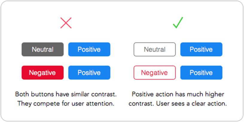
(Source: ux movement)
Adding background colors to negative buttons will draw the attention of the viewer and make him wonder if he should press it. The absence of background color will highlight the insignificance of the negative action.
I have learned these guidelines from my experience and from my designer friends who produce brilliant designs. As I said earlier, one rule doesn’t apply every time, but yes, some tricks help create smart designs that subtly leave an impact.
I also suggest you use minimal colors. You don’t want to add tons of blues and greens and complicate the viewers. Befriend simplicity and get going!
You’ll learn what works for you better, as you start designing. Remember that it takes time and practice to master the art of designs. Until then, take inspiration from recognized designers and those whose work you love. Keep reviewing different websites to stay in touch with design trends.
What do you think about these cheats? Let us know if I’ve missed out on something!
Hamas Hassan is a Digital Marketing Executive working for Cubix, a software development company in Washington, DC. He has been a technology writer for the last several years he loved to write everything which revolve around emerging technologies of today’s era like Artificial Intelligence, Blockchain, Mobile Apps, and Digital marketing tactics. By having a vast grasp over that helping thousands of readers to learn and enhance their knowledge.