Source: https://www.pexels.com/photo/person-using-black-and-white-smartphone-and-holding-blue-card-230544/
Convenience is the holy grail of user satisfaction which, in turn, is the driving force behind conversion rates and in-bound traffic. Since your website will be the ‘face’ of your brand promoting the products it is known for and letting customers know what makes your brand stand apart from the rest should be done in a manner that’s seamless, intuitive and accessible.
Below we discuss some simple features and element you can incorporate, and the manner of doing so, in order to boast a robust and convenient website that will ensure consumers are finding the check-out section instead of bouncing off because of bad website design choices.
A streamlined navigation system
A user who’s not completely on board about a service will browse through different sections of the web before they can get to a conclusion. For this purpose, transitioning between the different pages should be intuitive and smooth.
A prominent navigation bar coupled with well-defined categories or headings on it help to reduce decision fatigue and clarify the next destination for the visitor. Furthermore, the placement is also important with the centre or top right of the screen serving as the ideal spots for a nav bar.
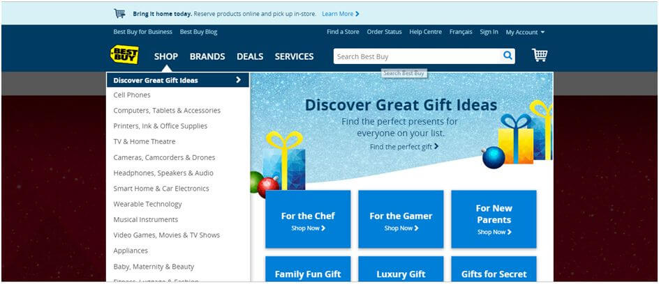
An e-retailer like Best Buy, which houses products in a lot of categories, handles this quite well. Without over-cluttering any part of their nav bar, they follow the correct scheme of having the important sections to the right, as where readers would start, to having the search bar on the left where users will input their desired keyword for following up on a product.
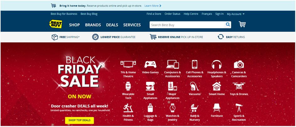
The full range of categories can be accessed via the drop down menu by clicking the Shop heading.
In this way, the navigation tools allow the user to only take steps forward without treading back, until they’ve finally arrived at the check-out section and added an iota to the ‘visitors converted to consumers’ count.
Securing the deal
There are several elements at play when you talk about the final stages of a visitor’s purpose: purchasing the product. This is the phase during which you can absolutely not mess up a single thing since that may lead the user to backing away from the deal. The first and foremost step is to build a simple check-out page that’s relatively straightforward and descriptive.
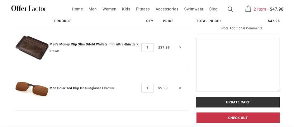
OfferFactor pays attention in this regard by employing a minimalist design for their cart section. The headings are clearly defined and the ‘Update Cart’ and ‘Check Out’ buttons are bright and visible.
There’s no unnecessary information that’s irrelevant to the checkout section and things can proceed as smoothly as possible.
Let Them Choose Further:
Don’t just stop there. To facilitate purchases further, include options to select from different regions of the world so that the price tags reflect the currencies of those countries as well.
For example, Diane Von Furstenberg has a number of locales to choose from. Of course, a visitor can make use of Google convertor for currencies, but such a feature on the web saves them the effort. Moreover, it also removes any barriers or confusions users from different countries may have since it’s easier to visualize or quantify a price tag if it’s in their native currency.
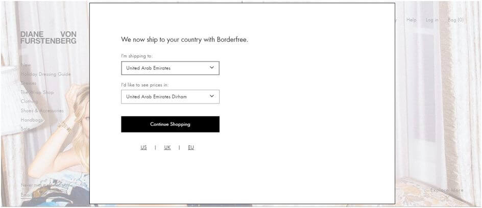
Thus, by ensuring everything is convenient when it comes to money matters, the order for purchase edges every so closer to confirmation.
Utilizing CTAs for urgency and clarity
Similar to how a navigation bar works for the homepage, the Call-to-Actions (CTAs) work throughout the web to achieve the goal of ushering the user across the different sections and pages. CTAs are clickable buttons that derive a response from the user and save up on time and effort on the user’s end.
Take Trello’s homepage’s example for instance and the bunch of CTAs present on it.
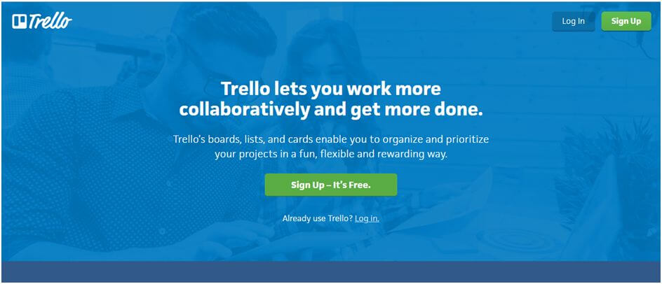
Thanks to the highlighted colors and styles that accompany a CTA along with their noticeably big size and regularly shaped structures, visitors can process information much quicker and thus make decisions much faster.
So every time you’ve been convinced by a ‘Read more’, ‘Buy now’ or ‘Download this’ CTA, no that it served the purpose for which it was designed for.
Optimize for speed
Your ecommerce platform’s best guess at not frustrating the users away is to keep a check on the page load times. In a world full of deadlines to be met, meetings to attend and busy tasks to be fulfilled, the need for speed is real. Most parts of the world suffer from poor bandwidth and internet connections while the latter with moderate connections are annoyed by inconsistent load times for a web page.
However, for a dynamic website, you can’t run away from elements like high resolution images, flash elements and gifs/videos.
For this purpose, utilizing a fast Web Hosting service is the key to the goal at hand here. Thanks to building up the speed of your serve, these hosting services will directly affect your web load speeds as well by allowing you to incorporate the elements mentioned above more efficiently and with the least amount of load possible.
Optimize for mobile
The number of smartphone users in recent years has risen considerably and it’s no doubt why 4 out of every 5 consumers are smart phone operators.
Moreover, the time spent on mobile websites and the amount of traffic the platform receives from handheld device users is more than the desktop counterpart. All of these facts certainly pertain to the importance of optimizing websites for mobile devices. In addition to including even less information on screen at all times, the font needs to be big and readable.
Moreover, since ‘tapping’ will be the way visitors navigate through the web, your web designers would need to ensure the size and area of touch for the CTAs is big enough to be convenient for the user.
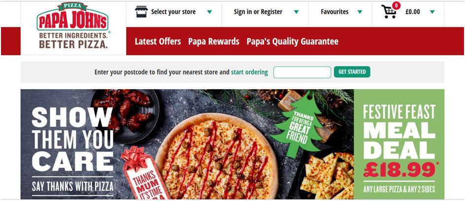
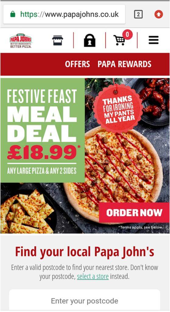
Looking at Papa John’s example, between the two website versions for desktop and mobile, they make subtle changes to allow for ease-of-use on the user’s side. Of course, it’s easy to deduce that the mobile version has larger CTAs, has removed descriptions for icons alone and the placeholder for Postcode holds less space and succinctly tells you what it requires instead of a whole line of text as can be seen in the desktop version.
Small details like these make for a convenient user interface be it on any channel so the web is accessible from anywhere.
Conclusion
A convenient user-experience on a web page goes beyond the aesthetics and visual outlook; it’s about inter-connectivity, smooth transitions and clarity, all acting as reasons for the visitor to stay a bit longer on the web.
Thanks to optimizations that bring justice to the robustness of the design via the robustness of how it operates regardless of the channels, user satisfaction is met. These factors account for an increase in conversion rates, and hey, if the visitor goes away without a purchase, the authentic and convenient design would still linger long enough in his mind for an order to be confirmed at a later date.
Chris Mcdonald has been the lead news writer at complete connection. His passion for helping people in all aspects of online marketing flows through in the expert industry coverage he provides. Chris is also an author of tech blog Area19delegate. He likes spending his time with family, studying martial arts and plucking fat bass guitar strings.