A zillion ideas pop up and vanish, once we sit to make a good infographic. Ever since 2010 info graphs have been an in thing for the majority. It’s colorful and informative yet entertaining. Yes, it has different niches and genres but it’s fun to make as well as read. Plus, if I can understand something easily from an infographic why would I bother reading an article about the same thing?
The problem arises when we make one with all our heart and energies but it doesn’t get much attention. It’s a sad moment for us, isn’t it? Why? Why didn’t they get it or saw it be as appealing as you thought it would come out as? There’s no point thinking about what’s done, relax. Let it go. Breathe.
The world is a strange, strange, place where not everyone has the same perception as the other. So the attraction principle is somewhat difficult to understand. What can be done by you is that you follow the below-mentioned pointers in your next info graphs and see the visible difference and appreciation from the audiences. At the moment, all you need to do is pay attention here so others can pay attention to your work. No, no one is trying to boss you here. The reason for being so persuasive is that the tricks and advice being shared here have been taken from the professionals and those people are at the top in what they do.
If you adopt and use them – trust me you – a lot of likes and shares will come your way.
Target Audience
The first thing you need to decide is which type of audience do you wish to target? You can’t always connect with everyone and have a banging content post as well.
Focus your energies on a defined target. This way you might have to make more than just one infographic in order to connect with all sorts of audiences but it would improve your relationship with the catered audience. Plus, it would also keep them on their toes for the next time you post something for them.
Simple & Focused
Keep your content simple. You don’t need to use fancy words and high vocabulary nor do you have to make your sentence length. Keep it short and focused. If you want to say “the curtains were blue” just say that it was you don’t have to be a novelist and be all “the curtains were the color of a bright night sky embellished with a hint of white and grey” – no you are not writing a book or a story. Be uptight and straight.
More visuals, fewer words
You don’t have to use too many words in order to get your idea across the targeted audience – instead … use visuals. Your main motto should be to use fewer words and more images. Don’t crowd it, no. Just if one plans to read an info graph s/he should feel the difference between reading a blog post and info graph, you know. Just like when you make points for a lecture or a test – you revise the headings, not the whole book, do you? It’s as simple as that.
Promote it
Once you are done posting it – remember that you need to share it on all of your social media sites. It won’t look like you’re too full of yourself, relax. If you want people to see it then you need to be able to share it and show everyone it.
If the one who posted it doesn’t have the courage to share it why would anyone else do it?
Ask all your good friends to do you a favor and share it as well. It’d become a chain. Once, their friends see it and like it – chances are that they might share it as well.
Easy to read; Font carefully
Once you’re done with the content – decide a good font type. You don’t want the audience confused between words and wince every now and then because the writing is either too small or smudged for them to understand.
‘This is not the type of font you want to use’
‘This could work, maybe.’
‘This is a no way unless you are able to read what‘s written here without straining your eyes.’
Manageable Length and Size
This is a very important point and you need to always check if the pictorial or info graph you’re publishing is the right length and size. If it is too long it’d be very difficult for people to read it. If it’s too small then again it’d be difficult for everyone to read. For example; the one shared below is easy to give an idea to those who just want to know the basics and not go into depth – yet it also has information for those who want to read it in the description.
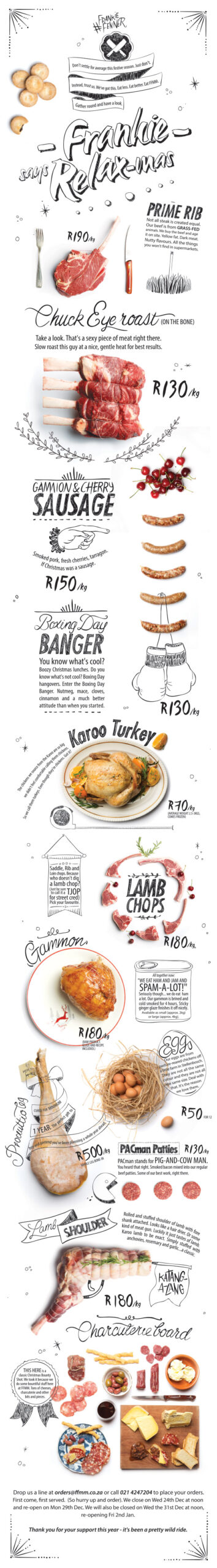
Source: https://www.inspirationde.com/image/32292/
Killer Headline
Once you’re sure of the topic you wish to talk on – you need to come up with a headline that would not be more than 5 – 6 words and also is a statement in itself. While thinking of the headline, be sure to make one that is able to peak interests and speak reality of the content within it. Don’t talk about one thing and give them an entirely different thing in the content – that’s just wrong ethically and morally as a writer.
Focus on the flow
Keep a clear head about the topic and don’t go talking Brits in one statement and Greeks in the next. You need to stay true to the topic and not yap at all about the ‘ohs’ and ‘ahs’. It’s not at all required in the minimal content you are trying to woo your audience with.
Facts and Figures
Use interesting facts and figures to talk about in your info graph. It would peak the audience’s interest and help you make an efficient graph with all the whatnots. One time, a pizza place gave out an info graph that had its historic journey to portray that they still have their Italian soul within them. Likewise, Fat Burger has one too – they are interesting and so can be your content!
With this said do not forget to cite sources. If you used someone else’s content for inspiration, it is fine to cite and give them the appreciation they deserve. Otherwise, you could end up getting sued for literally just using an idea in different words.
Proficient Tools
When making an info graph, you need to know which tools to use. You can only know this if you practice using different tools and applications. You’d be able to select the one that sets your demands and style as per each info graph you make. Moreover, you’d also have your own experience to know by yourself which one of those tools are proficient and which ones are a waste of time.
Some of the best tools for making a good infographic are; Befunky, Snappa, Visme, Infogram, PiktoChart, Visualize and Google Charts. These are not the only good ones, however, keep using new ones and you might just discover a better one.
Talk the talk
When you have the power of words; use them to touch upon different topics. Breakthrough social taboos and solve the problems that are common in your area. If there’s been a burglary nearby – take a lesson from that and help people protect themselves. It’s all about how you put it up.
You can challenge the society and call them out at wrong perspectives. You can promote socialism and animal rights too with it. It’s all about how you represent whatever you choose to.
Face the music
You can make your content even more interesting if you search for the stories of origin be it for humans, animals, literature or any other subject. You can also study some of the extreme cases in the history like the black plagues etc and make your info graph about that.
If you are making one for your business brand – it is totally fine to talk about something other than just your brand. If you talk about your brand it would give off a negative image of it as if you’re forcing people to take it and do not give any importance to what their interests might be. Thus, it is always great to go out of your immediate field and hook the audiences on all the new things you can cater them with.
Spice it up
You can also make your info graphs more interesting by spicing it up by looking up different niches and the cultures within a culture. Go make one on the various cultures in different cities or countries.
Another great idea is to combine to or more ideas and produce a single info graph. For example, if you’re a Potter-Head and have a good knowledge about Hogwarts and whatnot – use that in one of your info graphs. You can make one that represents the houses and the states of the country. You can also be more definitive and use it for the celebrities or all the famous people globally.
Designing the Info Graph
Forecasting the design
When you want to be sure of the design – you need to be sure of the story and title first. They are what the design will be based on. So the foremost and the things to prioritize are the themes, story, and title … not the design. Once you’re done with it, you can make a rough sketch on paper to see how it fits and make a design as per the negative spaces and visual data etc.
Frame
When you start designing the info graph – start with a grid or wireframe. It helps to keep a balance between the written content as well as the pictures. Moreover, you’d know the width and height of each picture you put in. Thus, you won’t be facing any difficulties when finalizing the ratio between everything since it is important to keep a consistency in margins throughout the design.
Layout
Go for a layout that shouts out to the information you’re going to put in it. There are zillions of layout templates to choose from; single column, split up two-sided columns, report layouts, sea change, the Brexit, this vs that etc.
Don’t choose the one that looks pretty to you instead choose which mixes well with your information – you don’t want to use this vs that sort of a design when in reality your content is based on a 3 ways of life kind of a thing. Be sane and intelligent.
Envisage Data
Pie charts, column charts, graph charts and line charts are highly common in representing data. The one you want to use should hold consistency as per your data. Do you want to talk about a single number or multiple? Is it a comparison in time or just the now? Ask yourself such question and then decide on the chart type. An info graph might be small but it takes a lot of thinking an effort alongside creativity. Look into everything before going digital!
Elements of design
You can either use typography or photography or both as the elements of/for your design. When you can’t explain something by being visual only that’s when typography comes into play and helps you through. Many NGOs use typography over photography as it gives the audiences a better understanding. However, one thing to keep in mind is that – even when the background and other such visuals are playing a secondary role in your design it does not in any way mean that you use too many words. Be short and get your message across to the audience.
However, the perfect info graphs have texts as a secondary item to their design and are more prone to represent the ideas visually as they have more impact. Photographs are tricky to use when you do not have a photographer at hand – you can use license-free images at sites like; Pexels, Unsplash or Pixbay. When choosing photographs – choose the ones that resonate with each other like with the similar color scheme or backgrounds, sizes, and themes etc.
Contrast
The use of contrast is able to make us give importance to the point in question very easily. The contrast in colors helps mix bold and light colors together in a way that we immediately pay attention to not just the detail but also what’s being provided to us in bold and hot colors. Pair up colors that complement each other. For instance, try a black colored background with dark yellow text to make the headline.
You can also create a contrast using typography by either resizing or using more than one font. If your normal body text is at 16 then your subheading should be an 18 and the header should be at a whopping difference of 22 in a font size so that the audience is clear about the subject in question.
Imagery can also work as a tool of contrast. It depends on how you use it, that’s all. You can make something like the one shared below to give you an idea.
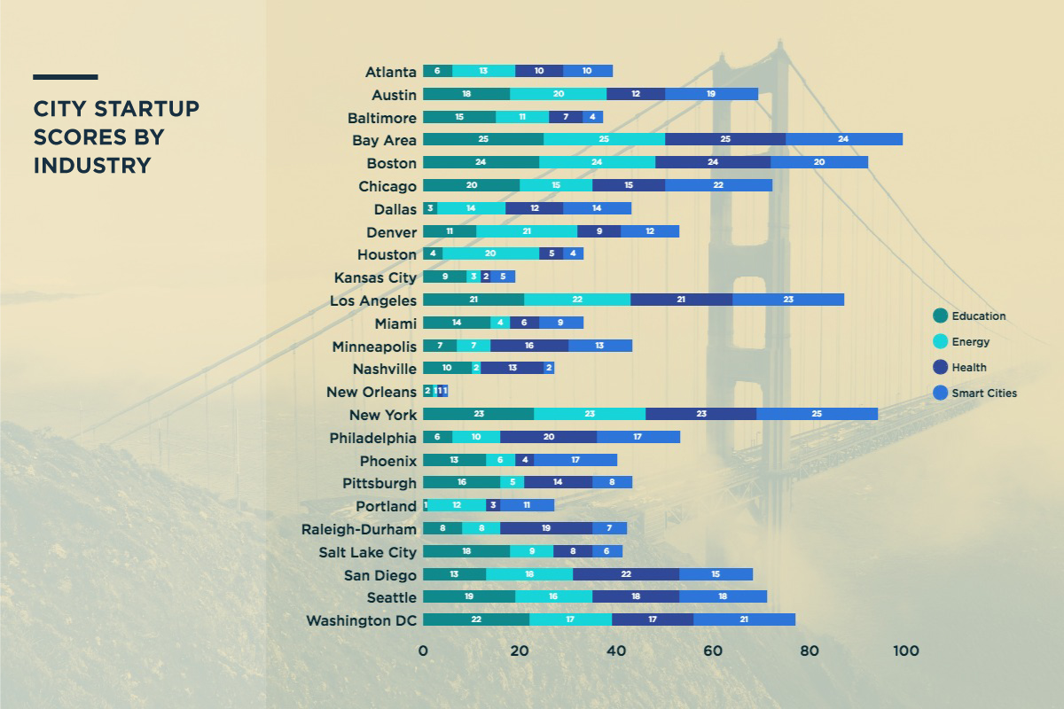
Source: https://www.1776.vc/reports/innovation-that-matters-2016/
Balance
No matter how much people say they do not have a visual OCD let’s just accept the fact that everyone has it. If there is a symmetrical or asymmetrical balance within your info graph to help it be seamless then you’re in a good place to be appreciated. A well-balanced infographic content is in cohesion throughout the texts and images. If you’re using a heavy image on top then use light ones for the rest of the info graph. There is only one main image that speaks volumes of your content and data – be sure yours is as main as it should be.
Colour Scheme
Choose a color scheme that best suits your design. Pick up two or three colors and centralize your info-graph around it. You can use other colors as the mild secondary colors that can go with the flow. Brighter hues with a suitable use are also fun and appealing – too much dark or neon color can impact on the reader’s eyes and stress them so be careful while experimenting with them.
In case, of a business info graph – you can always use the brand colors to make it more “brandy” even if the topic is outside of your brand’s comfort zone.
Consistency
There should be a consistency in your design from top to bottom. If you’re using numbers for your points then don’t switch to bullets midway. It looks messy and bad that the maker did not even have a sense of direction and was confused between something as petty as bullets.
It’s not just about bullets but also the pictures. In short, if you’re using a particular pattern (color palette, font style, picture design etc.) – follow that pattern.
Negative Space
Negative space is quite impactful on your design and the info graph as a whole. It is the space between everything from your imagery to typography. You don’t want your info graph to either be too blank or too crowded – either way … it’s not worth checking out even.
If it is too crowded the reader’s eyeballs would probably pop out and be lying on the ground by the last sentence and that is if anyone actually reads it. For instance, if you’re using the font size as 16 then you should keep a line space of 1.2 in your info graph.
The idea of negative space is to make sure there is enough space between words and line as well as the images throughout. It should not look like you put 20 hens in a space for 5 hens. Why? Because it looks sad, miserable and forced.
Conclusion
In the end, there’s nothing more to say than that now you are more than able to make the perfect info graph to get as many likes and shares the world has to offer. They might not come in the blink of an eye but they surely will come knocking at your door if you keep practicing.
Practice makes perfect and perfect comes to those who try.
Nathan John is a Content Editor at Chuchi Magz and he contributes in various online communities and writes for technology and trends.