If you put your clients first when designing your landing page, then you will be on the right path. Try to fit into your customer’s shoes. There are other critical visual features that you need to pay attention to, such as topography, texture, and color. Something appealing to look at and related to your theme.
Many brands have remarkable CTAs on their landing page; you can visit them and make an analysis. After compiling all your research and applying all the ideas, you should be ready to design an outstanding landing page.
Be an Audience
While designing your page, think like an audience and ask yourself what would inspire you from a landing page? What would be your pain points as a customer? If you sincerely put all these into consideration, you will eventually meet the needs of your audience.
Focus on What and How you Will Benefit your Customer, with Your Goods and services
Other people are offering the same things as you. What will make people come to you and not go to them? When you focus on “what” you are providing, think about the benefits it should come with. Also, “how” it is going to help your target market.
Let your audience feel cared for and not like all you care for is to sell your products and services. It is what makes you stand out from the rest.
Understand your Customer Needs
When you understand what your target audience needs, the rest will be a walk in the park. Could it be, in search of a product that works, and they have exhausted all available options? Maybe it is an experience of better customer service? Are you solving a problem that others couldn’t? Those are the kind of questions that should be in your mind.
Anticipating their needs allows you to satisfy them. You may have the right answers and solutions for the answers above, but you are not creative. At this point, you can approach aweb design services to assist you and come up with a compelling landing page.
Monitor your Page
Now that your page is operational find out what works better for your customer and why?And vice versa. Google Analytics is one of the tools you can use to help you find your audience’s response. It will show you where they click most, the time they spend on your page, and their reaction when they visit your page. When you test your tools often, you collect more data, and you also adjust faster to the process.
Make Use of Landing Page Tools
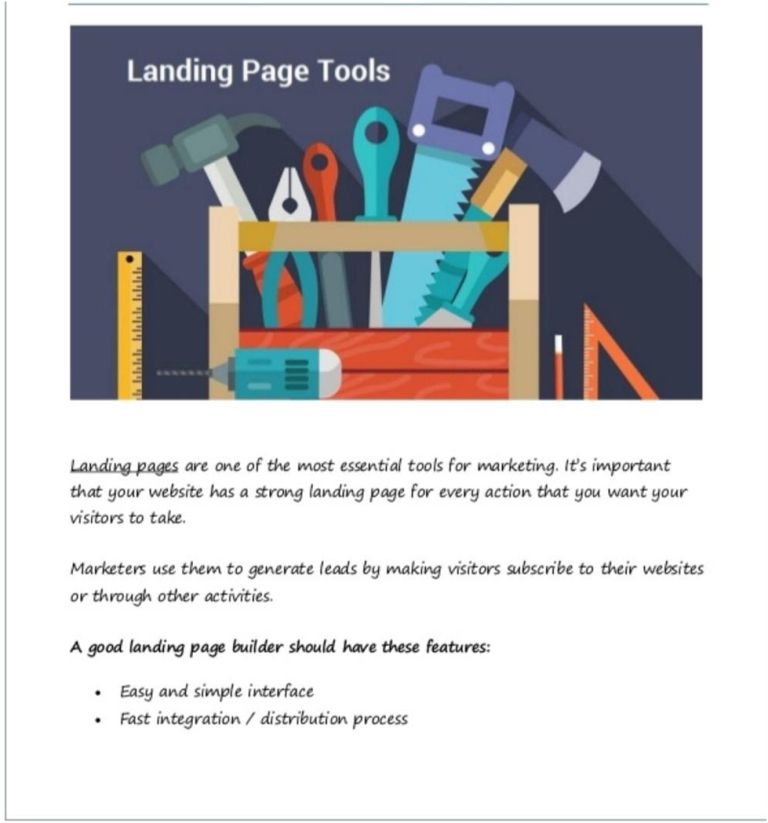
When we add a tool to our system, it makes our work easier and faster. So why not find some of the best tools to use. Instead of going for web design services, buy landing page tools, and design your page without stressing out. Some of the tools that you can use are; GetResponse and Unbounce.
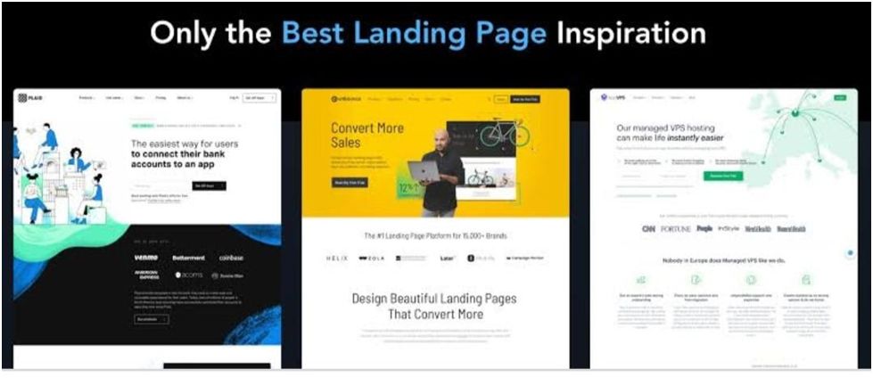
Compelling Elements for Landing Page Design
Outstanding Visual: Ensure the images are relevant to your theme and are of good quality. The use of infographics has become prevalent; you can consider them but avoid going wild.
Bold Sticking Headlines: It is the most crucial part of the page. It should call someone from a distance to come and see more. It also gives a visitor the reason to read what the page entails. Nobody will strain to find out what the heading says. Keep it bold and bright.
Include Social Proof: The reason why you will find most landing pages using social proof, it’s because of social-psychological thinking that people most likely tend to engage in action when they see others doing it. Marketers have discovered this concept and are embracing it too.
Striking Call of Action (CAT); Just as the word depicts, they put you to act. Most landing pages occupy either a half-page or smaller but are highlighted and placed in a place the visitors can’t miss them. It increases your conversion rate.
Add Complimentary Offers; Freebies can be enticing, even when customers can afford them. They are a smart way to collect leads.
- HelloFresh
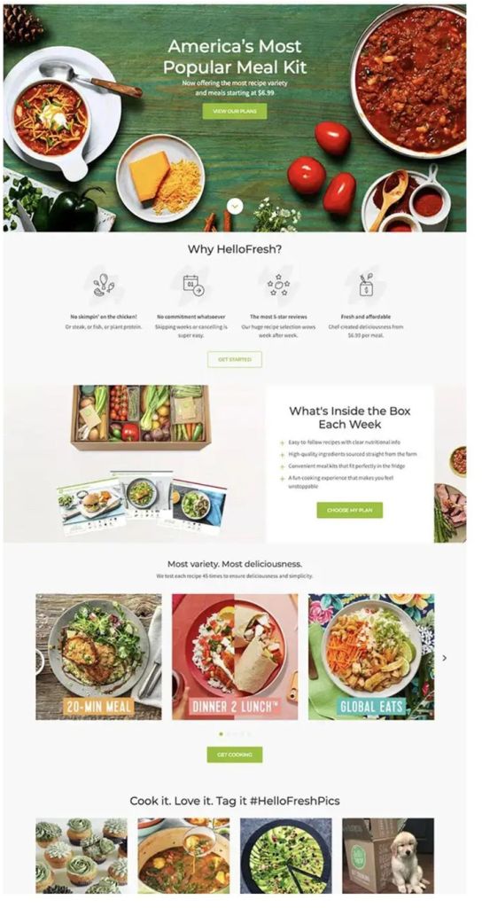
Looking at the page, you immediately start to salivate. The graphic used here makes it feel real. If you are hungry, you are most likely to dial that number to make an order. They have also indicated that they do service delivery. They have used the right words that drive a clear message, just what you want to hear. Tops as one of the best designs of a landing page.
- MeUndies
By far, this page tells you that the web design service did an excellent job. The highlights are what customers want to know. The fabric is soft sends a message that you won’t regret having their products. “Comfortable” is what everyone is looking for. Using graphics and GIFs, they have shown the buying process in a smart way that looks inviting.
- Luxury Retreat
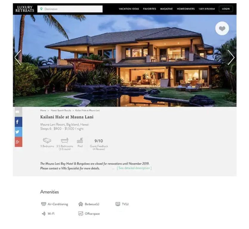
When you open this page, the color makes you feel luxurious. The graphic used here is on point. The highlight is the type that wants you to start packing and head to a retreat. They have included what to expect so you won’t be surprised, and a rating that shows credibility. Their page also shows other services that they offer apart from retreats.
- UberEATS
The simplicity of this page is fantastic. Most ingeniously, they have used two large imagery that says what they do. Although they don’t sell food, they have put some delicious snacks that they deliver and one side, a transparent graphic that prompts you to download their app.
- Fiverr
They have used a headline that is asking a question. It causes attention to the readers, especially those who might encounter a WordPress customizing problem. Price starting from $ 5 looks affordable. A video begins with testimonials that tell you they are trustworthy.
- Snapchat
They have highlights of the color combination of cool and warm, which give the page a bold look. The use of animation makes the page look attractive. They have written what you are likely to get, and there will be no surprises. Also, they have incorporated videos and logos of other brands as social proof.
- Tumblr
Their page uses more graphics and less content, but then again, they are warriors of visual content. A short form is displayed, unlike in other pages where you find almost occupying a full page. It encourages the visitor to fill it without spending much time.
- Zoom
The most exciting part of Zoom’s page, it has only one field that needs filling, keeping it minimal. They have used examples that one can relate to. The small text clearly says that their interest is business emails because their targets are organizations. They are using live chat for quick support, while you are still browsing.
- Airbnb
They have used a beautiful persona with a pop-out call of action that can make one ready to sign up. It also entices you by stating how much you can earn weekly. The background feels homey, which relates to what they do. It is direct and straightforward.
- Adidas
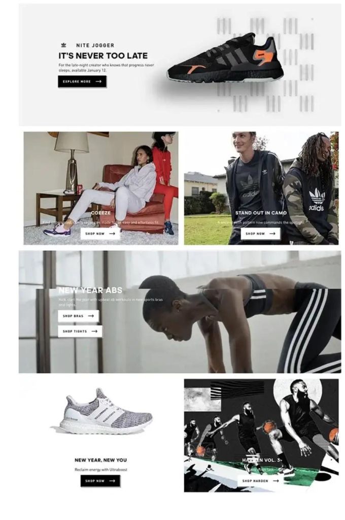
Using six of their products, they have articulated them on only one page. They have also used minimalism in color, which relates to their brand. Adidas’s newsletter signs up is easy and smooth without pop-ups.
In conclusion, if you are in the process of designing a landing page, you need to take all the positive endorsement shared in this article. With an appealing page, your conversation rate will go up. You should feel lucky because the company’s samples that we have shared may have acquired web design services to have them look the way they do. You don’t have to pay a penny.
Naman Modi is a Professional Blogger, SEO Expert & Guest blogger atebuilderz.com/, He is an Award Winning Freelancer & Web Entrepreneur helping new entrepreneur’s launches their first successful online business.
Social Media Links Below:
Twitter- https://twitter.com/eBuilderz
Facebook- https://www.facebook.com/eBuilderz
Pinterest- https://in.pinterest.com/ebuilderz/pins/