Website navigation is the most important aspect of user experience. It helps visitors find what they are looking for and converts them into customers and leads. This improves customer satisfaction and reduces bounce rates (exits).
If your navigation is not well-structured, your visitors may not be able to figure out how to use it. This causes frustration and could cause them to exit your site.
Search engine bots index the website by crawling through it. The navigation could make it simpler to find new pages and understand their context. This could impact your website’s SEO.
You need to design website navigation that’s easy-to-use to optimize the user experience. This will ensure that visitors stay on the website long enough and lead them through the conversion funnel.
Following are some ways in which you can improve your site’s navigation:
– Creating a navigation plan
– Making navigation quick
– Removing unnecessary pages
– Avoiding dropdown
– Adding dropdown arrow
– Using simple labels
– Ordering menu items strategically
– Indicating user position on the website
– Applying sticky menu
– Using hamburger menu
– Indicating menu hierarchy
– Making links easy to tap
– Creating a fat footer
– Designing mega menus
– Adding a search bar
– Linking blogs and product/service pages
– Sticking with proven conventions
– Studying Google Analytics
– Analyzing website heatmaps
– Conducting A/B testing
Table of Contents
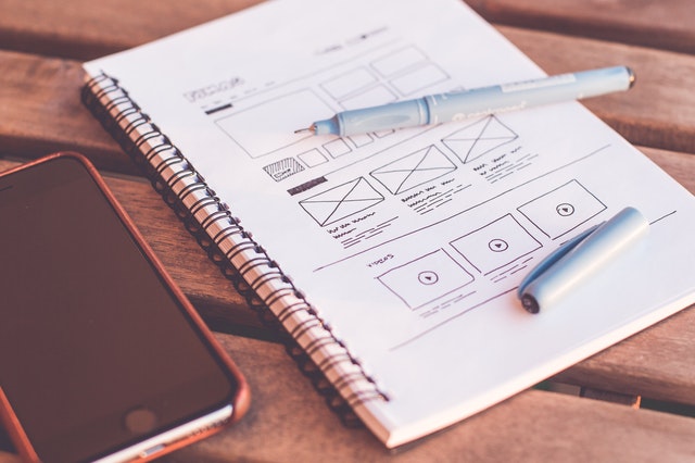
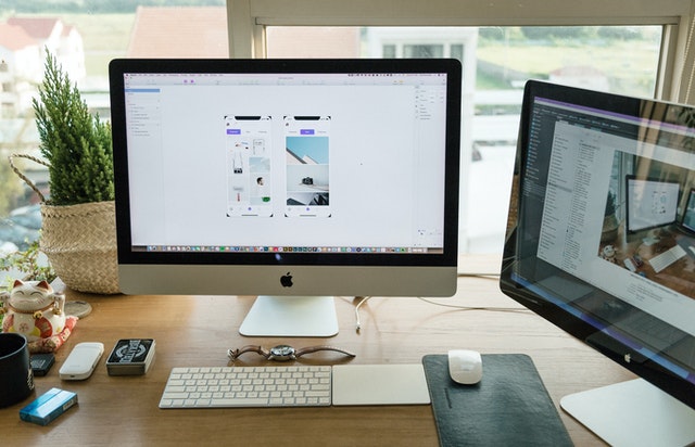
Navigation Plan
Instead of going with the available template, it’s always best to plan your web design. This way you won’t have to make several changes to the template after realizing that it doesn’t work for you.
Professional web designers typically start by deciding what webpages to create based on what features they want to offer. They develop a sitemap, which acts like the site’s blueprint. It can help you define your menu and other aspects of your website.
You can develop it as a flowchart, a list or a spreadsheet as per your comfort. Define the layout with main pages and subcategories.
Quick Navigation
Visitors shouldn’t have to click more than three times to reach any other page. After all, they may not necessarily enter your website through the homepage. They may enter through blogs, products, etc.
You need to flatten the website structure as much as possible. This means reducing the number of levels in your web content. It’s easier to find the necessary content when it’s not hidden under a subcategory hidden by another subcategory.
Another simple way to make navigation faster is to include links to your main pages on the menu. Ensure that the menu bar is visible on all webpages and remains the same. The footer can also help you connect all your web content.
Removing Unnecessary Pages
Sometimes beginners add more webpages than they need. This only gives you unnecessary links that make navigation more confusing.
For example, you might not need a separate page for locations if you only have two offices. You can display them in the footer and contact page. (Though there’s nothing wrong with creating landing pages for them.)
Identify the pages that seem unnecessary and remove them to narrow your user’s options a bit.
Avoiding Dropdown
Dropdown menus can feel disruptive. A user may hover over a link after deciding to click it, only for seven more choices to appear below. That’s why many web designers prefer avoiding them altogether.
Avoiding dropdown might not be possible when you have many links to include. But it’s not always necessary either.
In some cases, you just have or want to focus on a few products or services you offer. You can include them in the menu to streamline your navigation without dropdowns.
Ideally, you should have no more than six or seven categories on the navbar. It’s simpler for the users to process and choose from.
Dropdown Arrow
If you can’t avoid having a dropdown menu, consider adding an arrow or a plus sign. These small icons tell your visitors that your navbar has more options for them. This way, they won’t feel disrupted by the extra options and can decide what to click calmly.
If the main category is also clickable, then make sure that the user knows it. Add some microinteractions like changing the mouse arrow or highlighting the link.
Simple Labels
There’s no need to get creative with how you label the navigation options. It only confuses the visitor. You should use simple labels that anyone can understand at a glance.
Keep your visitors in mind when labeling the categories. You might offer industry-specific services, but your visitor may not be familiar with technical terms.
Try to convey what the visitor will see when they click the link in as few words as possible. Cryptic or misleading text annoys users and may cause them to leave.
Order Of Menu Items
On any given list of items, the first and last items are the easiest to remember. This is called the serial position effect.
The effect works on the website menu as well. Visitors are attracted to and tend to remember the first and last items well. So anything you put in one of these positions becomes the most prominent element of your navigation.
That’s why you need to take care of the order in which you add the items to the menu. Place the most popular and important links in these parts.
Position On Website
When browsing for a long time, it’s easy to lose track of which webpage you’re on. Many of us tend to click the menu link we’re already on. An indicator can help users keep track of which webpage they’re on.
You can do this by highlighting the webpage on the menu. This can be as simple as inverting the colors of the selected option or darkening it. It leaves no room for confusion in the visitor’s mind.
Breadcrumbs are more subtle but help visitors keep track of the webpages they visited. Place them somewhere visible like under the banner.
Sticky Menu
Scrolling up to reach the menu bar after going down can be annoying. Fix the menu to the top so that users can use it when they need it. It’s especially important for long content pages.
Some designers use a back-to-the-top button but that’s just too many steps. You first need to tap that button, then the menu option. With a fixed menu, you can go to another page with one click.
Hamburger Menu
While using a website on a mobile browser, you may notice an icon with three horizontal lines in the corner. This is called a hamburger menu.
The hamburger menu emerged as a solution for responsive design. It compresses the menu so that you can view the site on a small screen without anything in the way. When you tap the icon, the menu expands revealing different options. You can also use it on the desktop version.
Some designers use the word menu instead of the icon so that visitors can find it with ease.
Menu Hierarchy
Distinguishing categories from subcategories on the menu is usually not an issue for desktop users. But it can be confusing for smartphone users. You can solve this by adding arrows that expand and display the subcategories.
Take this a step further through slight variations in colors and indentations. The subcategories could be a shade darker than the main categories.
Tappable Links
On the desktop, the small pointer has no trouble clicking small buttons. But on touchscreen devices, tapping the links can be tricky.
Fingertips have a larger surface area than a pointer. If the links and buttons are crowded and close together, then a user may accidentally tap the wrong option. This causes frustration and could lead many to leave your site.
To avoid this, make sure that your links and buttons are tappable. They should be large and have enough gaps so that people tap the button they mean to.
Fat Footer
If someone reads your content from top to bottom, it means that they’re deeply interested in your products and services. Use your footer to highlight insightful content by including links that you couldn’t fit into the main menu.
These links could lead to main pages, landing pages, policy pages, resources and whatever could cause them to convert.
Webmasters often use this space to display trust badges to assure visitors of their website’s security and quality of service. You can also add contact details, timings and map locations.
Mega Menus
Limiting the menu to a few options is not always possible. Some stores and agencies offer too many products and services to fit on the navigation bar. Adding them all to a dropdown menu may create a long list that doesn’t fit the screen.
In such cases, using a mega menu is the right option. Mega menus are large panels that drop down or fly out of the navigation bar and display several links at once.
You can arrange the links based on their hierarchy for a neat look. For example, you can place links for different types of shoes under the category shoes. Play around with typography and colors to set the hierarchy.
Some web designers add icons to mega menu links for visual appeal and clarity.
Search Bar
A search bar is a neat solution for a content-heavy website like an e-commerce site or video streaming platform. Users can search for what they need through relevant keywords.
Place it on the menu bar so that visitors can spot it instantly. You can stick it with the menu for convenience’s sake.
Make sure that it produces results relevant to the search terms entered while adjusting to spelling mistakes. Sometimes, you may not have the content or item they are looking for. Instead of showing no results, provide a list of items, that may be relevant to the term enter.
Linking Blogs And Products/Services
Many companies produce several insightful and compelling blogs. They can give your visitors an idea of what you do and improve your SERP ranking.
Add links to the relevant services/products your blog talks about. This way, you can lead readers to the products/services they may be looking for.
You can also add links to related blogs on your service and/or product pages. Your visitors can learn more about you before buying your product or service. This also creates horizontal linking that benefits your SEO performance.
Proven Conventions

User experience is more important than innovation in web design. That’s why most web designers tend to stick with proven navigation strategies. These may include placing the navigation bar on the top or linking the logo to the homepage.
These conventions are proven to work and most users are familiar with them. Even someone who doesn’t know English can navigate the site as long as you stick to the basics.
You don’t need to reinvent the conventions to impress users. They might end up confused instead when they can’t find the menu bar or such.
Google Analytics
Analyzing your navigation is the only way to know whether it’s effective or not. Google Analytics can help you get the general idea of what’s working and what’s not. It offers many tools and features relevant to this step. Use them a few weeks after launching your site or making updates to its navigation.
The navigation summary report gives you an overview of how people find a webpage. It tells you where the user was and where they moved. You get a list of webpages through which users entered from and where they exited to.
Combining this data with the visual flow report gives a clearer picture. It visualizes the path your visitors take through your content into a flow chart. The sizes of nodes (pages) and connections (paths) give you an idea of how many people use them. Traffic percentages and the number of sessions are also displayed here.
The goal flow report gives you a user flow report based on the goals you’ve set. It can help you identify the parts where people have trouble converting or tend to drop off.
You can optimize your navigation based on the Analytics data. This may include removing or relabeling items that rarely get clicked based on their importance. Or adding popular items on your site to the beginning.
Website Heatmap
Website heatmaps can help you track how visitors interact with your site. They can give you insights on what links your visitors click, what content they read, what they skip, etc.
A heatmap is usually color-coded with warm tones indicating high engagement and cool tones showing low engagement.
Use the data to customize your website to gain more results. Combine heat mapping with A/B testing to find what works and what doesn’t.
A/B Testing
Minor changes in navigation can make it simpler and get the visitor to click the buttons you want them to. That’s why professional web designers often conduct A/B testing on their sites.
A/B testing is a method in which you create and compare two versions of a webpage. You display the versions to users at random and note their performance. The web designer makes changes based on the results.
The variations could be minor or major, depending on your needs. You could simply test the font sizes, placement of CTAs, etc. to find the best version.
Summarization
Steps to create user-friendly website navigation should start during the initial phases of web design. Create a plan to define the layout of your website.
Flatten it as much as possible to ensure that visitors can browse through it quickly. Features like fat footers and mega menu can help visitors go between webpages quickly.
Sticking with navigation tactics that are familiar and proven is usually a good strategy. But analyzing the effects on your website through analytics and heatmap is the only way to know if they work. You can make changes to your web design based on the results.
Mobile-friendliness is also another factor to watch out for when designing the site. Features like sticky menu, hamburger menu, etc. can make it easier to navigate on mobile websites.
Shayaan Khusro is a content writer at Red Dash Media. He specializes in digital marketing and loves exploring emerging trends in web design and SEO to create insightful blogs.