Having a clear, well-written business proposal is essential to every B2B and might be one of the main differences between winning and losing sales and, in the end, growing and shrinking.
To make it right, you need to present your company, products, and services in their multiple facets in an engaging, exciting way.
You want your prospective clients to know everything you’ve worked hard to offer. Well, you have done a lot, and products usually have many benefits and features. But your proposal can’t be too long, because you don’t want them to get bored with too many details, texts, and an enormous amount of data.
Here is where visuals kick in. They will help you to say a lot about your business and save everybody’s time.
At first, using visuals to organize and show data, ideas, and plans may seem daunting, but it is not necessarily. If you have the right tools and a few concepts, you get it done quickly, and we will show you how.
Table of Contents
What is a business proposal?
First things first: before starting something, you need to know very well what it is.
A business proposal is a document you will use to persuade a prospective client to buy your products or services. It has the purpose of acting as a source of information and also as a sales pitch.
The best way to do it is by finding out what they need, or the so-called pain points, and providing the best solution to help them out. You can identify these needs in three different ways, and that’s why there are three types of business proposals: Unsolicited, formally, or informally solicited.
Everything you will do from now on when creating your proposals depends on the kind of approach. Let’s see what changes from one type to another.
- Unsolicited
As you may have figured out, unsolicited business proposals are pitch decks made by a company trying to sell a product to a prospective customer that has not requested it. This kind of business proposal uses a very generic approach. As a result, there is a lack of understanding about the buyer’s needs. This type of approach is a sort of shot in the dark, and it is improbable you will reach the target by using it.
But if you focus on a few prospects and do extra market research and personalization to fit customer pain points instead, you will be able to offer a customized solution and become persuasive, which is the key point of a good business proposal.
- Formally Solicited
This is the easiest one since your business proposal responds to a company request. In this case, you will know what the prospective buyer needs, leaving you in a much more comfortable scenario. All you have to do is to write a proposal meeting these needs. But you can do more than that, of course, because chances are you are not the only company your prospective client has requested a proposal. So looking for other needs they might have and trying to meet them is also a good idea.
- Informally Solicited
An informally solicited proposal is somehow similar to the previous one, but with this main difference: the details. As they are usually the result of an informal conversation, you probably will not have all the information you need, so more profound research is required.
Now that you know what a business proposal is let’s move on to the real purpose of this article: showing how to improve your business proposals by using visuals.
Use infographics to compare two (or more) things
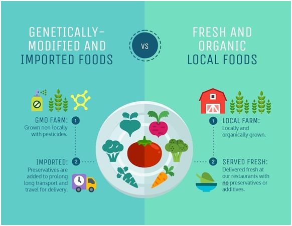
A good business proposal should highlight what makes a product or service the best solution to a prospective client. The best way to do it is by comparing, which also can be very helpful to your client if you have more than one product that may fit his needs.
In these fast-paced and highly visual times, we have to show our point in an engaging, quick way. To be succeeded in this task, you can leverage comparison infographics. They put options side by side and are a great way to make information easy to understand. And with a smart color selection, you will turn your infographics into a powerful tool to communicate in a more straightforward, effective, and memorable way.
See how it works:
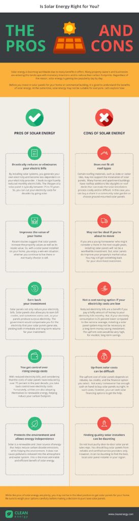
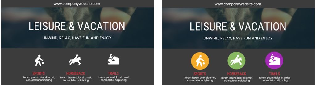
Using different colors for each point will make your infographic more clear and engaging. Look for colors that complement each other, like purple and yellow or blue and orange, like in the simple infographic below, which helps anyone understand whether solar energy is right for them instead of electric power. Note that no specific product is mentioned, which can be convenient if you want to sell an idea or educate your client before presenting a product.
In some situations, it’s helpful to use a template created for commercial purposes to compare your product to competitors. And when your company offers multiple products or services, you can use comparison infographics to give customers a chance to know the options and pick the one that better fits their needs and budget, just like in this pricing comparison:
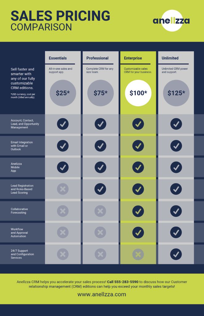 As a result of your market research, it won’t be hard to figure out what works better for your target audience, so you can create multiple versions of an infographic like this and highlight different options depending on your prospective client.
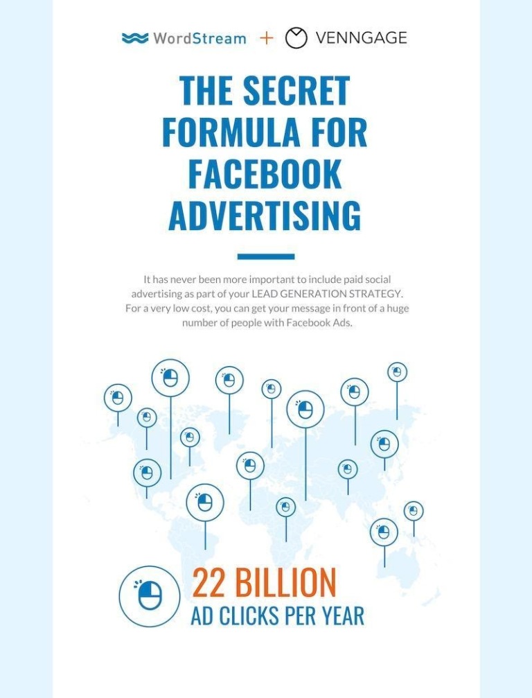
Use infographics to present statistics
You can rely on statistics to support your arguments, as data is a powerful backup to prove what you are saying is true. And you can enhance the impact of your data by presenting them in an engaging way. To do so, leverage infographics to organize, highlight, and present your information in an impactful, eye-catching way.
See below how to create an excellent statistical infographic even without being or having an in-house designer.
Creating a statistical infographic:
The first step is picking a suitable infographic template. Bear in mind what kind of data you want to share. It depends on who your audience is, marketers, HR teams, or executives, for instance. Also, your company’s voice and the amount of relevant information (you don’t want your reader to think you are wasting his time) are aspects to take into account.
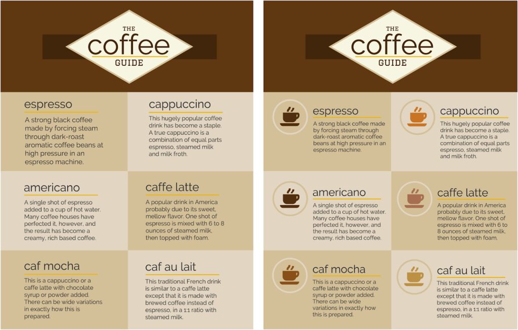
After, you can start to customize and create your graphic. Chose icons, charts, and pictograms to fit your data. Icons are great to empathize, contrast, and turn visuals into a powerful tool, as you can see below:
Pro tip: Use background shapes to get a boost of clarity and a fresher design. Compare these examples and see how it works:
You also should customize the color scheme, fonts, and even photos to fit your message. When creating an infographic, you will notice that color has a significant impact not only on the feeling of your visuals but also on clarity and organization.
You can use color to group related elements, comparing and contrasting information.
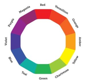
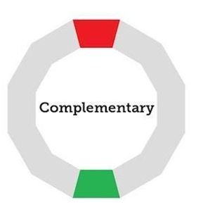
Using complementary colors, for instance, is an excellent option for creating contrast and highlighting small bits of relevant information. A thing of theory now: complementary colors are across from each other on the color wheel. Like this:
Remember the infographic on solar energy? That was a comparison infographic. Now, see below how using complementary colors in small amounts can be eye-catching and make a number stand out.
Orange is the complementary color to blue, and it contrasts with the central theme, drawing attention to the statistic. When creating infographics for this purpose, it is important to allow one color to dominate and use its complementary in a small area.
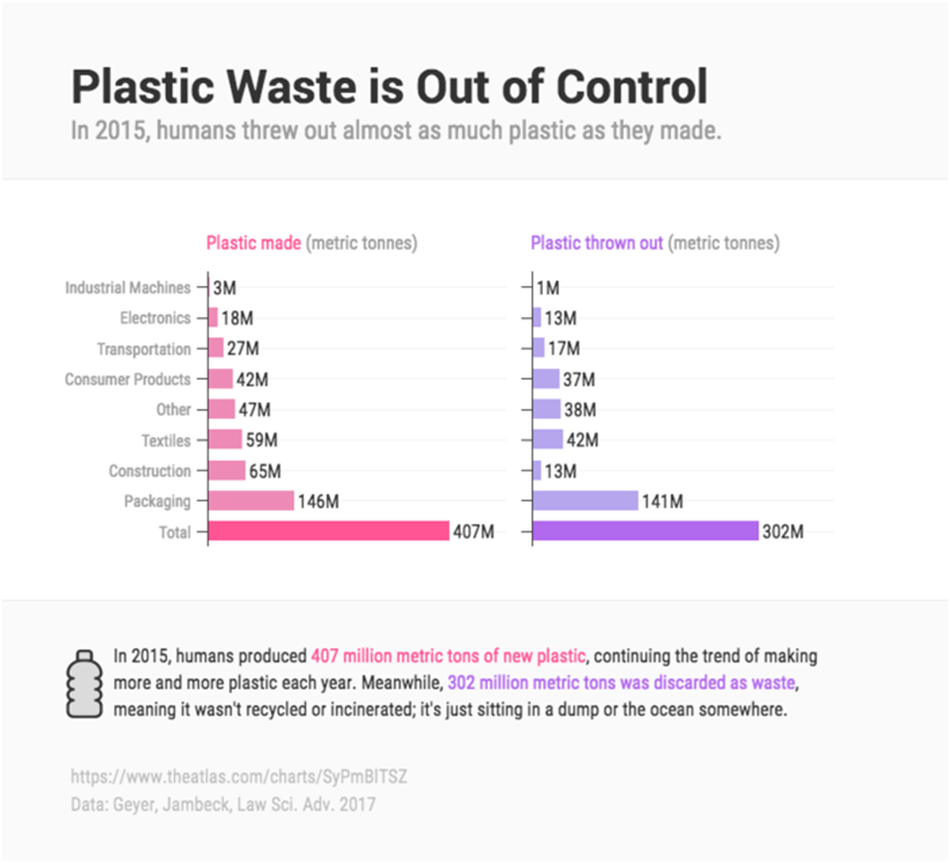
Use a simple bar graph to compare data
If you want to play it safe, you can use a classic bar graph to compare data. And the good news is that you don’t have to use a typical Excel chart: you can make an engaging and yet simple design instead.
Take a look at how you can use a slightly different color to emphasize key data:
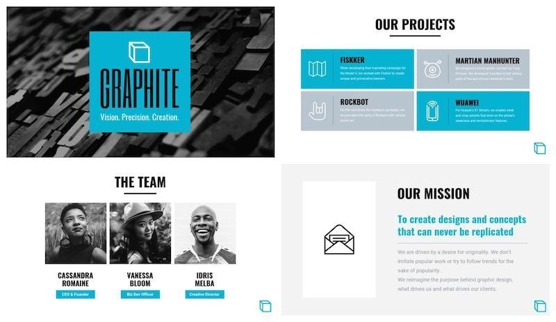
Include an organizational chart – Meet the team
Organizational charts will communicate your brand’s values and philosophies. Depending on your team and how you design it, people will see your company as inclusive, collaborative, or hierarchical. So before creating your chart, take time to think about your values and your prospective clients’ as well. An organizational chart helps your prospective customers and stakeholders understand who is in charge of the main process in your company. You can use charts also as a chance to show your expertise by including a brief presentation of the leaders of each department related to the product or service you are trying to sell. This is a great way to reassure your client that your business is in good hands.
You can use a photo of the team if you want to talk about it or highlight the most important people, as they are the life of your brand and what makes you stand out from competitors. But try to keep it short: when adding them to your business proposal, I recommend using only a single slide, as they did in this example.
Conclusion
Writing successful business proposals is all about understanding your client, their pain points, and presenting yourself as someone who can help them properly.
Now that you know how to enhance your business proposals, it is time to browse through links in this article and put these tips into practice. Start now creating your business proposals to close more deals and grow your business today!
Alessandro Oliveri is a Content Marketer at Venngage. After many years working as a journalist, he now enjoys writing on visuals, SEO, and content creation. His aim to help people to simplify the content marketing process and take visuals to the next level.