![]()
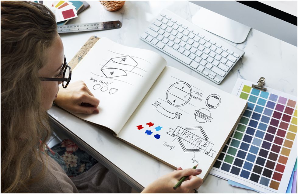
Designing logos is the trickiest project to get we agree, but it also gives you an excellent opportunity to be creative. The logos have to be memorable with originality and something making them unique from the jumble of other logos.
The logo of a brand conveys a lot of information about the business, and it is one of the fundamental requirements of starting up a venture. A logo can set you apart from the competition, or it can get you sidelined. It is the identity of a brand, and that is why it is ought to be on point.
It merely means that every choice you make while designing a logo from colors to fonts is critical in shaping the public opinion about the business. It affects how people feel about the brand, and of course, you want them to feel good, no?
Several simple tricks can be incorporated in the process of logo designing and give a boost to your business. Have a look at them!
Table of Contents
Make It Resizable
This tip is for both logo designers and business owners. Logos are used in different places like business cards, emails, letterheads, posters, social media posts, websites, apps, and many many other places. This is why it is crucial to design a logo that can be resized quite easily.
Before you fall in love with a beautiful and intricately designed logo, you need to make sure it looks just as fine when shrinking as it is looking in its original size.
You have to watchful of the details you are adding, so these details are not lost in resizing. Once a logo is finalized for a brand, it cannot be edited for a different platform, a single logo has to be used in different sizes.
A logo should always be scaled up and down to ensure it remains distinct, and the elements are not mixed up in any size. An ideal logo should be easy to discern, versatile, and scalable.
If the logo can be resized to suit the requirements of different platforms, your brand will be more visible. We all know how being visible and just being there works for the marketing of a brand.
Resized logos can be placed at more places, and it can significantly boost up the business.
Subtle Updates
No matter how well designed a logo is, there will be a time when it will go out of fashion or become old school. No business can afford to have an identity that is no more relevant if you want to stay in the race. You ought to remain relevant to the consumers. An irrelevant business is like dead meat.
You have to keep an eye on your logo if it’s aging. If you feel like it is time to make some changes in the logo design as it is growing old, don’t wait for long. Start making little tweaks and updates in the design as soon as possible.
Keep in mind that these edits in the design should not mess or contradict with the core design of the logo. The core design should not be changed because this is how consumers know you; they have associated that design with your brand, and stripping them of that association is not going to earn positive points for your business.
Changing elements over the year and playing with typeface gradually will not make it a drastically different logo overnight. Instead, your logo will be updated from time to time, maintaining the latest trends without giving a shock to your consumers.
The gradual changes in the icon signify two essential features of your business; change and growth. It will keep your logo in the highlights, and that will ultimately help with an increased business even after decades have passed.
Make Them Double Take

You need to be creative when it comes to logo designing. The most memorable logos will make people double-take when they first saw them. They are unique and have an oomph factor to them.
There should be something so intriguing and enchanted about a logo that it gets permanently pasted in the minds of everyone who saw it once.
You can play with the name of a brand and graphics or a visual entrance. Even visual representations of the text-only logos can make them stand out. You have to plat it smartly, and even the minor details can become a game-changer.
It is absurd to assume that you are the only one trying to stand out with a fantastic logo. Everyone out there competes, and that only means you have to be super creative.
Logo Alternates For Responsive Browsing
The digital world is complex, and it has so many layers. If you want to conquer today, you need to be a champ in the digital world. No business stands a chance of surviving, let alone being successful if their online game is not strong.
When you get your logo designed from someone else like you have outsourced it, there is a chance you may end up with a non-resizable logo. This can be a real pain for several reasons.
The best you could do in this case is to get a simplified alternate logo designed. It is not ideal, but it can save your business from massive fallout (negative by all means).
You can go for a text-only or icon-only logo for responsive browsing. Your logo needs to shrink rather than being witnessed incomplete when the window is down.
You also need to be mindful of how the logo is going to appear in different applications. You need to be sure how it looks on a website header, on a business card, on a mobile screen, and so on.
The layout of each of the platform matters somewhere vertical logo can be on-point, and somewhere you may need a more horizontal one.
No Clichés Please
It must be avoided at all costs!!
Every year there is some new pattern or a viral design type, and designers lose it completely. You should know better than to copying the masses.
These trends turn into clichés too quickly, and clichés can never be good because we are trying to get our logo unique, remember?
When the same idea of design is used again and again for multiple brands, no matter how cool it is, it loses its charm. It is like losing the essence of a logo when it becomes repetitive.
Styles that are turned into trends die out fast, and they become old in a matter of a couple of years. Brands having logos based on these trends lose recognition, and as a result, it also loses the business to its competition.
If you don’t want that to happen, then don’t repeat the mistake several have made before you.
Customize It
The customization of a logo goes a long way. Of course, when you have a logo that is designed for your business, there are meek chances of someone else having a similar design.
The audience tends to get fascinated by the logos that are specifically designed for the brands. The larger segment of consumers will appreciate it. Customize logos are also easy to remember and associate.
As soon as your logo appears in front of the consumers, they will recognize it. Every brand dreams of having a distinctive logo, but very few are successful in getting one.
You will have to search for the agency that offers customization and that have designers who can understand what you are trying to achieve through a logo.
Over the years, it has become too easy to create a logo using templates, plenty of which are available online paid and free both.
If you can get a custom type that will be lit, imagine having typography that is known by your brand, doesn’t it sound awesome? Logos with distinct typography have their swag that is quite unmatched.
Another good part about hand-drawn custom type logos is they are challenging to imitate. It reduces the chances of someone ripping off your logo.
Give It A Meaning
Now, you must be thinking that every logo has a meaning as it represents a brand. It is undeniable because every logo has a story to tell. However, some times the designers put extra effort and incorporate hidden meanings as well along with a direct message.
These hidden meanings are not detectable in a first glance, and the audience has to be keen to observe a purpose that is not apparent.
It is astonishing to notice how much time and thought process goes in the making of a single logo. The whole idea is to make it communicate with the onlookers. It is no secret that customers want something special from the business they favor, and if you fail to deliver them the uniqueness, you may also fail to retain them for the long term.
Deep hidden meaning in a logo delivers a message to the consumers that you take this brand seriously, and you are here to keep your promises. It shows you have out-thought and effort into the logo as a brand to reach out to your customers, and that always earns a bonus point.
It Should Be Owned
Your logo should be something that can be owned. It should be a design that people can resonate with and relate to. If you can be successful in making a relatable logo, you have also succeeded in making it memorable.
People tend to remember logos they can understand and relate to. It gets stored in the memory without having to force it. If your logo is a very relatable audience will start owning it, and it will be a household symbol.
This way, the logo will be highly recognizable, and it can drive massive sales for the business. Generic designs often fail to achieve this because they are so common that people get confused remembering them. Standard designs are difficult to trace to the brand because too many brands have a similar type of logos. It creates an identity crisis for the business, so the unique the better!
Some Ultimate Pro Tips
Try to keep the design as simple as possible. You may want to have your logo designed intricately with all the marvels of designing used, but in reality, the simplest logos are the best.
You may have a logo that is 100/100 from a designer’s perspective, but the design is too complicated for the general consumers’ likability, it will fail to make a mark. When you are in business, everything is a competition, and you need ace if you want to stay at the top.
The same goes for logos; you need to have a remarkable logo that is loved and admired by the consumers if you want your customers to remember it.
Try to use a single font, and if you think your design can manage more even than two fonts are more than enough. Using more than two fonts will just make a logo complicated, and it won’t be aesthetically pleasing.
Colors also need to be selected wisely. It depends on the industry of the business, too, you should not choose mismatched colors that don’t support the theme.
The psychology of shapes also plays a vital part in logo designing. Try to understand and implement it while the logo is being designed. If you have hired a designer, you can ask them what you desire for a logo. Never compromise on the quality of design; if something is not clicking, you probably should not go for it.
EndNote
Remember, you have to believe in your logo because if you are not convinced, there is no way in the world your customers will be influenced. Don’t settle for a design because it’s been long, and you haven’t picked one yet. Settle only when it feels right, and it makes you think for your brand in a glance.
Shaeel Ahmed is a digital marketing expert, and he has honed his craft of writing a well-versed, creative content. Besides writing, he is interested in reading and is up-to-date with latest global trends. He is currently working withlogo designing services. He is familiar with the art of writing engaging content and is ready to start a conversation with readers.