Whether people are aware of it or not, the psychology of color impacts how they perceive a brand or business. On an unconscious level the colors of a brand’s marketing materials, from logos to text to backgrounds, convey messages to those who view them.
Often times, businesses will want to rebrand themselves to modernize their overall look and feel, or to connect with a new audience. Likewise, when a brand is first conceptualized, business owners want to ensure they are speaking to their target audiences through the colors, imagery, and visual components that they choose. In this article, we will discuss the psychology of color and the most important aspects to consider when deciding on a brand identity for your business.
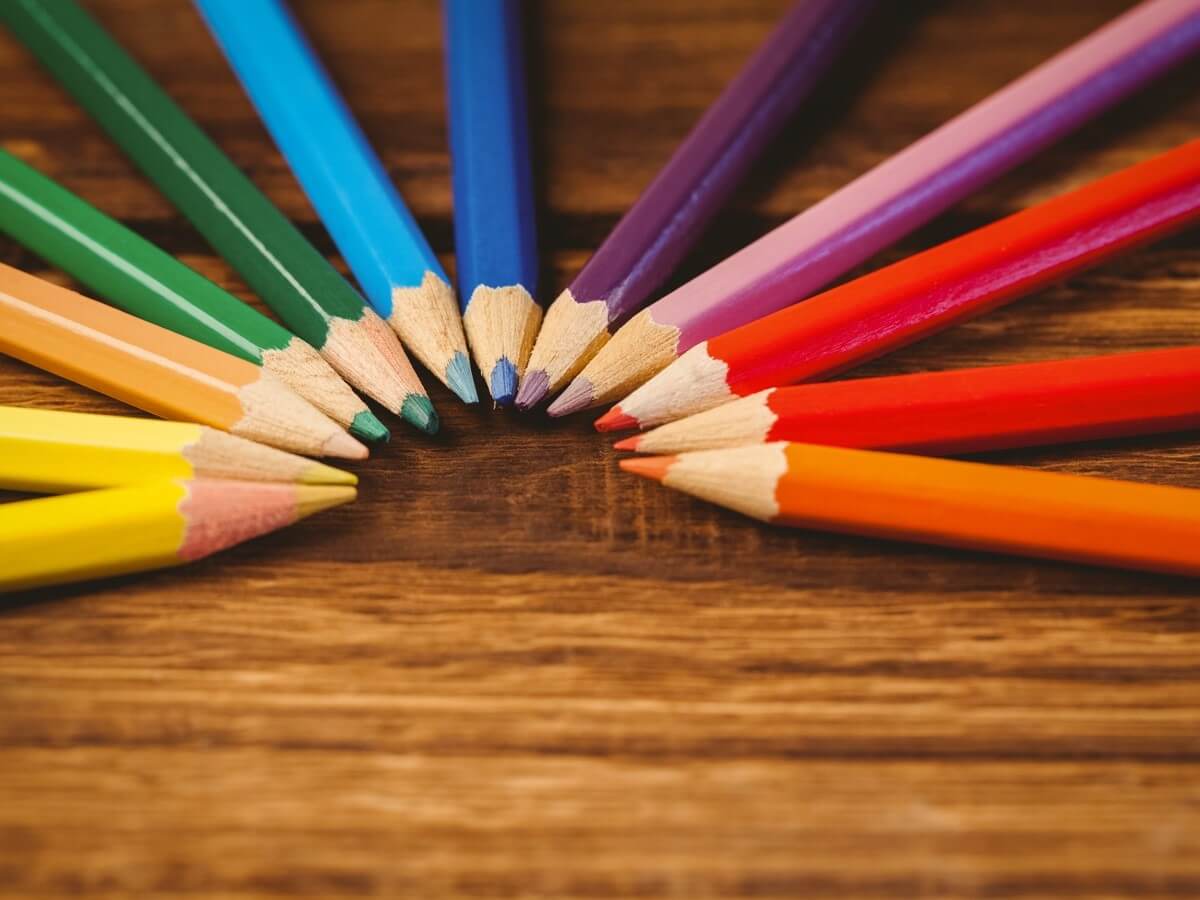
But first, let’s go over the messages associated with each common color.
Colors and Their Meanings
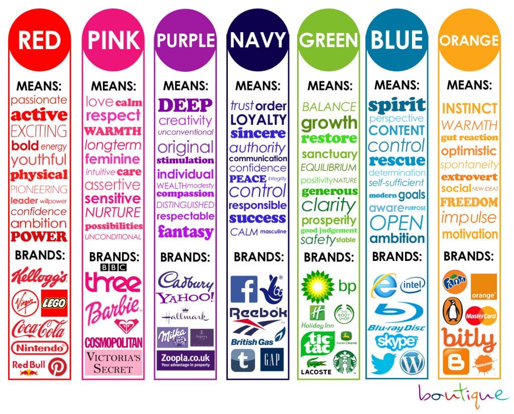
Each color on the spectrum communicates its own unique message. For example, yellow is associated with warmth and optimism. It is a color that inspires and promises potential. Grey on the other hand, speaks to balance, neutrality, and sophistication. Brands who choose to use yellow are often fun-loving and personable, like Sun Chips or Post Its. Brands who use grey tend to be more focused on intelligence and superiority, like Apple, Sony or Tesla. Another notable example is the color red. Red evokes feelings of excitement, urgency, and boldness. Many brands use this color to move people to action and create enthusiasm. Brands like Red Bull, Netflix, and Lego rely on this color to generate interest in their products and services. It makes those who see it want to act – by either buying an energy drink, live streaming your favorite shows, or constructing a new creation with famous building blocks.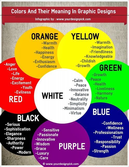
Blue, on the other hand, is a color with entirely different results. Blue makes people feel calm and appeals to our sense of trust. Brands that value being dependable and honest often choose to use the color blue. Brands like Wal-Mart, Lowe’s, and American Express have selected this color as a part of their brand identity. Why? Because they want their target audiences to see them as the “tried and true” option for their needs.
For a more detailed account of each color and what is means in relation to color psychology in marketing, see this article.
Now that you understand colors and their meanings, how do you implement them correctly? Below are our top tips.
1.Consideration for Color Matching
Picking a secondary color to accompany your primary color is equally as important for color psychology in marketing as choosing your primary color itself. Many businesses make the mistake of choosing a secondary color that they personally like, rather than choosing a color that appeals to the psychology of their customers.
 A common mistake that many businesses make is combining colors that have contradictory messages. Clashing messages from colors can leave your potential customer feeling confused or disconnected from your brand. For example, red is a color associated with action and urgency. But blue is associated with calmness and relaxation. When these two colors are used exclusively in a logo, it can have a conflicting impact on the person who sees it.
If you want your brand to be tranquil (for example, many spa owners want to convey this feeling), grey or another shade of blue may be a better option as a secondary color.

If you want to communicate action or power (for, say, an automotive parts company), colors like black or yellow may be better options.
2.Complimentary Imagery
Depending on what your business is, the photos and visual elements you use will be different. For example, an insurance company will likely want to use photos of families or children to remind potential buyers of the most important things in their life that they want to protect.

However, a bakery business will want to use photos of delectable baked goods, perhaps with steam rising from them to give a “freshly made” appearance. Every business is unique, but there is a common rule to follow: find photos that include colors that are part of your branded palette.
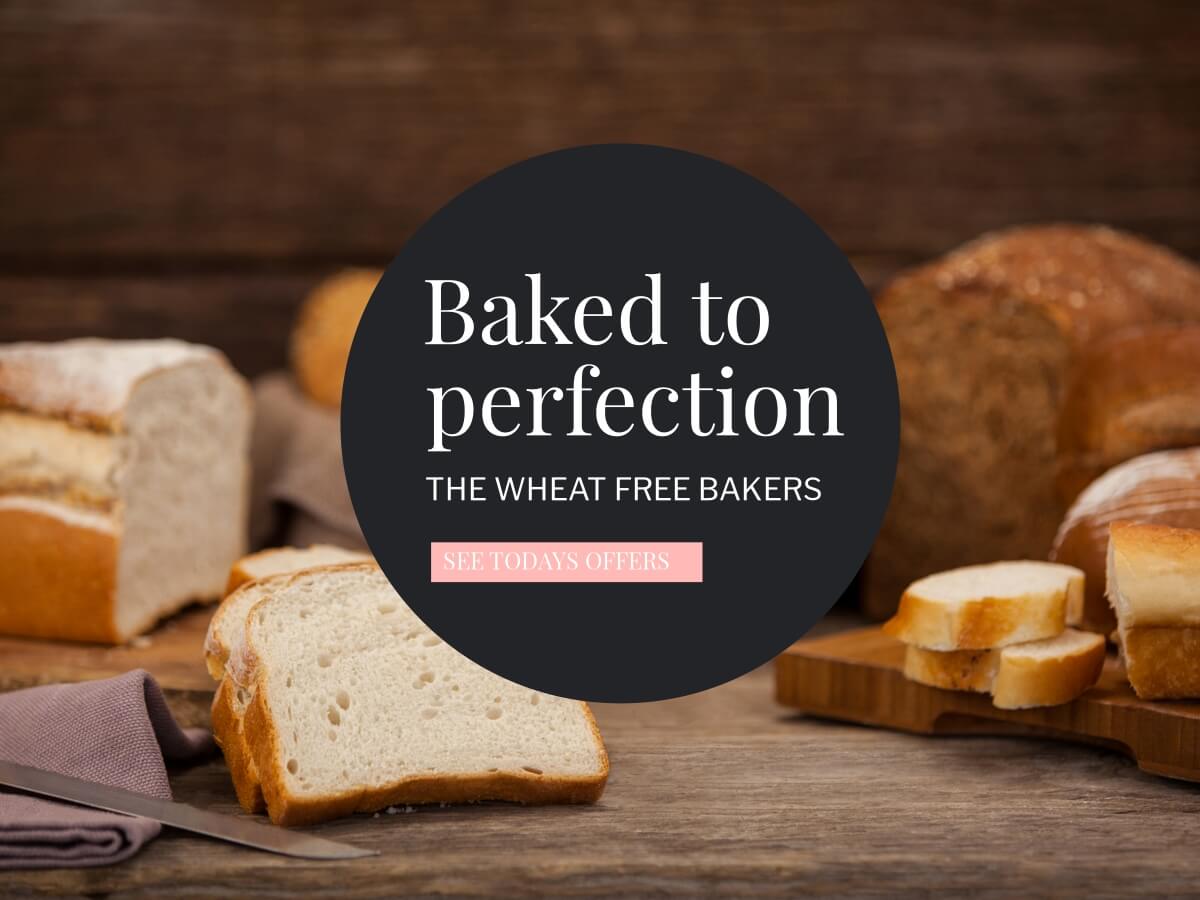
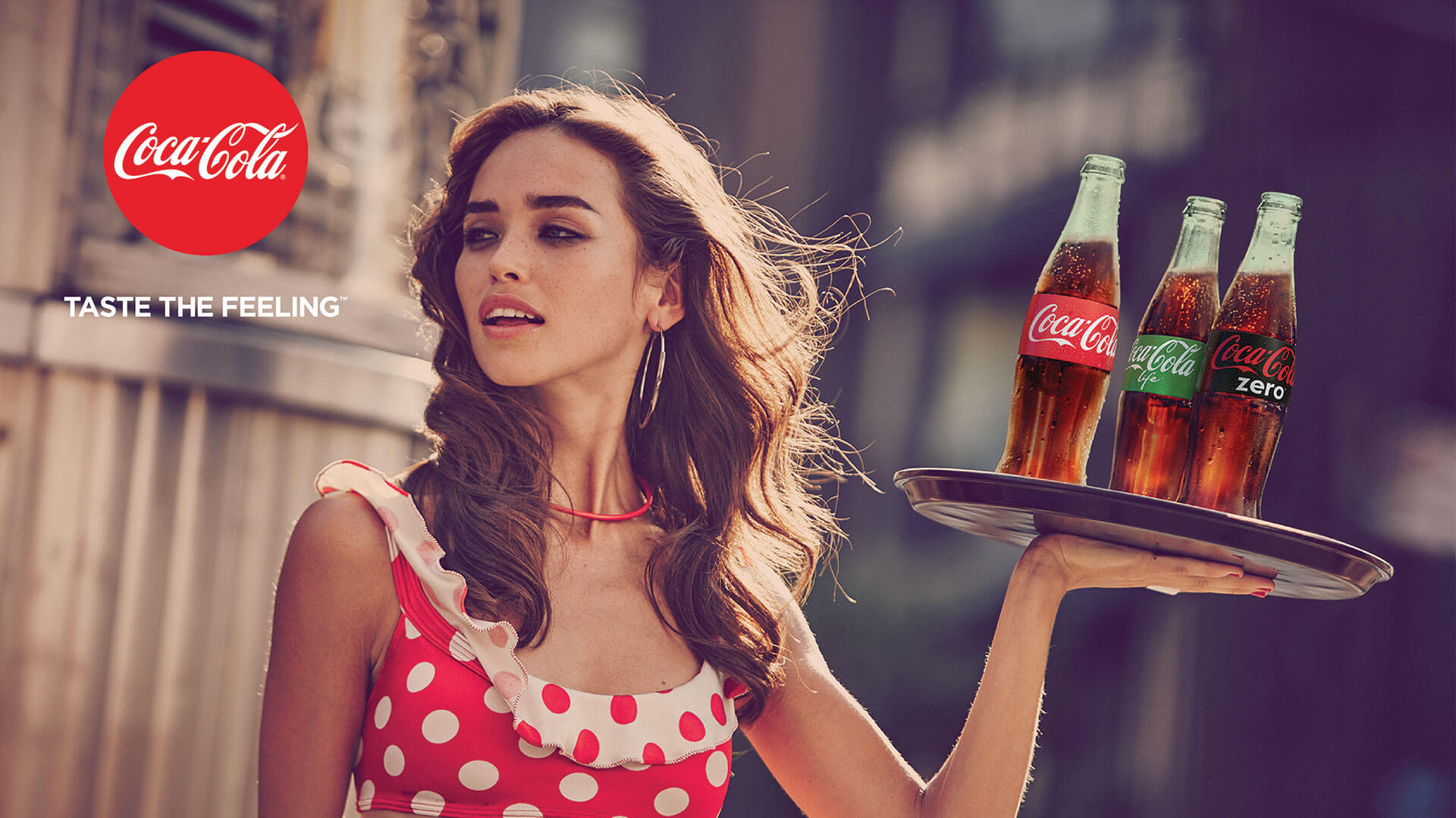
An example of a brand that does this phenomenally well is Coca-Cola. In the below image, you will notice that the photo has red hues and tones. The woman’s dress, the labels on the bottles, and the logo all share the same red color. Also, the neutral brown background matches the color of the coca cola liquid itself. This is a perfect example of a brand utilizing the psychology of color to create a visual impact.
3.Image Testing
Did you know that you can upload a photo to a software like Design Wizard and create a color palette from that specific image? This is also a terrific way to ensure your photos align with your brand. 
Upload any images you plan to use and be sure that the colors in the photo are close (if not exactly) to the ones you have chosen for your brand palette.
If the image doesn’t match your brand palette identically, you can try using a filter or manipulating the hue, saturation, and settings of your photo. 
Additionally, it is smart to A/B split test images to find which performs the best. You can run two ads that are identical, except for the photo, and see which performs best. By doing this, you will gain a better understanding of visuals that connect with your audience and drive conversions.
By editing each photo, you create a streamlined, branded look for all of your business visuals. A fitting example of this is the Play-Doh Instagram account. They consistently use bold colors that directly correlate with their brand, resulting in an entire Instagram feed that is constant and unwavering.
By following these steps, you can utilize the psychology of color to make your business more memorable and impactful. Brand identity is such an integral part of promoting your company and connecting with the customers you rely on.
Michelle is the Marketing Associate at Design Wizard. She spent four years studying Media Studies in Dublin Institute of Technology before completing her Master’s Degree in Marketing and Management in University College Cork. She’s delighted to work with such an exciting design software company and is eager to help Design Wizard continue to grow. Michelle is a dog lover. She enjoys going on hikes with her four-legged friend, travelling and going to the cinema (mainly for the treats).