You keep publishing massive amounts of content for your blog or site, but you get little returns.
Your conversions aren’t what you’d expected from all your hard work and you’re wondering what’s wrong.
You’re getting traffic to your site, but your bounce rate is higher than your conversion rate.
Your audience seems to read your content and then leave without doing anything else. The number of readers who follow through with action is way too low for the work you put in.
You’re sure you’re creating brilliant content, so you ask yourself, “What could it be?”
You might’ve even been using a call-to-action lately but it just doesn’t seem to do the trick.
What in the world could be wrong here?
Well, the simple answer is that your CTAs aren’t compelling enough for readers to act.
“Not all call-to-action messages are created equal.” – Neil Patel, Digital Marketing Entrepreneur
You need to create brilliant CTAs that excite readers and demand they take action. You need CTAs that stand out and intrigue your audience.
Good thing you’re on the right page to learn about what CTAs are and how to craft compelling CTAs for your content.
Table of Contents
What CTAs Are and Why You Need Them
CTAs Defined
A call-to-action is basically a prompt telling readers to take a specific action.
The HubSpot blog defines them as:
“an image or line of text that prompts your visitors, leads, and customers to take action. It is, quite literally, a “call” to take an “action.” An example of a CTA is “click here”.”
When it comes to blog writing, you can use different CTAs throughout your article. In fact, it’s best to use more than one to increase your chances of getting conversions. But the main CTA, your main reason for writing the article in the first place, comes at the end of your post.
Your main CTA is placed at the end to mark the intended progression for your readers. They’ve read the article which gives them vital information, now it’s time for them to take action.
In blog articles, the main CTA is typically in-line, meaning in the form of a phrase within a sentence. Other CTAs can be displayed in different forms and places on your page. Those we’ll look at later.
Examples of commonly used CTAs include:
- Contact us. This provides your audience with a direct method of communicating with someone who can assist them.
- Subscribe here. This allows readers to follow your site and read future articles. It’s also a good way of building a community of followers and your mailing list.
- Comment. This gives your readers the opportunity to share their thoughts on your article. It also allows you to hear from your audience.
- Learn more. This is usually a link that leads to more information about the topic your article covers. It can lead to another article or some sort of offer to gain more knowledge.
- Enroll today. This CTA is typically used by course vendors who guarantee to teach expertise on a subject. It leads to a tailored learning management system with the online tools needed to learn.
- Buy now! This CTA wants to excite your audience into buying a product or service you’re selling.
- Limited time only! Here, the goal is to create a fear of missing out (FOMO) in your readers. They need to act now or they’ll regret letting go of the opportunity.
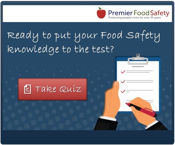
- Take the quiz. This is a great way to learn more about your audience and their defining characteristics. In exchange, you can offer them greater knowledge of themselves they might not have.
A CTA’s Purpose
A CTA is the first of three parts in your conversion process, meaning it’s crucial to get this right. The other two parts are:
- A landing page which explains your offer and the benefits to your audience. It’s where conversions actually take place.
- A thank you page that shows your gratitude to your readers for following through with the action.
CTAs provide purpose to your content and a link to tangible benefits for your audience. Your readers expect to find compelling CTAs in your content.
This is why it’s crucial to get CTAs right. Otherwise, you could:
- Lose your readers’ trust by not delivering on your CTA’s promise.
- Miss out on leads if no one notices your CTA, therefore making your content worthless.
- Unsettle your audience by seeming desperate for them to act.
- Create resentment from readers who end up thinking your content is a waste of time without a CTA.
- Confuse your readers if your CTA isn’t clear.
Whereas brilliant CTAs can:
- Increase your conversions considerably, meaning a better-looking bottom line.
- Help you build an appreciative community that’s grateful to you for giving them answers.
- Lead to trust in your expertise and the products or services you offer.
- Explain clearly what you offer your audience.
What Goes Into Creating Captivating CTAs
There’s a lot that goes into crafting the perfect CTA – from how and where it’s displayed to how it’s written. Every aspect needs to be considered and none are less important than the others.
Great CTAs have the following elements about them:
They’re placed strategically so that they stand out from the rest of your content. The best CTAs are remarkable and instantly identifiable to your readers. They have to be obvious and placement plays a big role in that.
The most used placements on a website for CTAs include:
- In-line: As mentioned already, these CTAs are included within your content. This placement makes them the most relevant to the content you write.
- Above-the-fold: These CTAs appear in the top half of your page without the need to scroll. Your audience instantly notices them when they land on your page. They usually take up a large chunk of the top part on your page.
- In sliders or popups: These seem to appear out of nowhere on a page. Popups appear smack in the middle of your page once readers reach a certain point. Sliders usually appear on the bottom-right side of your page.
- In the sidebar: These CTAs can either remain static as readers scroll or not. Here you can use visuals to promote your offers or provide extra information. Sidebar CTAs aren’t always related to your content, but they are relevant.
- In a bar at the top of the page: CTAs here are static and visible as the readers scroll. However, there’s little space to get creative. Header CTAs are short and simple in a narrow bar.
They’re urgent enough to convince your audience to act now. You want readers to click on your CTA asap, otherwise, they might forget to do so or lose interest. Creating that sense of urgency is done by using certain words that evoke time and deadlines like:
- Now
- Before X date
- Today
- While stocks last
They’re short and simple, making them easy to understand. These CTAs get more conversions than long ones because readers don’t want to spend time on them.
They’re direct. Great CTAs have strong action verbs that tell readers exactly what action to take. Don’t offer your audience suggestions or ask them if they want to do it. They do. That’s why they’re on your page expecting CTAs in the first place.
Start your CTAs with strong action verbs like:
- Buy
- Sign up
- Download
- Enroll
- Comment
- Click
- Fill
- Contact
They excite your readers into taking action. Your audience must want to click on your CTAs after all. You need to create CTAs that bring out a strong emotional response and enthusiasm.
The use of exclamation marks allows you to captivate readers with your CTAs and make them passionate. You can use an exclamation mark in examples like:
- Buy now!
- Flash sale!
- Half off!
They’re relevant to your page and the topic addressed in your content. You shouldn’t put a CTA on your page only for the sake of it, one that has no real relevance to the specific page. This only creates confusion for your audience and they likely won’t return to your site again. Let alone click on your CTA.
They appeal to your audience. CTAs have to be direct but in a friendly way that welcomes readers to take action.
There’s no point coming off as threatening when your goal is to assist readers. Don’t forget that your audience is on your page looking for answers to a topic or problem.
Use a friendly tone to create a personal bond with your audience.
Start Crafting Amazing CTAs
Congratulations, you now know what it takes to create compelling CTAs.
You know how critical a good call-to-action is and more importantly:
- Where you can place your CTAs
- Which type of verbs to use in crafting them
- How your audience should perceive them
You no longer have to worry about your conversions if you can put this advice into practice.
Katrina McKinnon is the founder of McKinnonGroup.com.au. We create content – at scale – for content marketers. Buy pillar pages, skyscraper posts, blog articles, People Also Ask articles, content upgrades and more.