eCommerce is on the move, in more ways than one. As the industry surges to reach $4.5 trillion in sales by 2024, so too does the popularity of accessing it on-the-go.
The shift to mobile is upon us – mobile traffic reached 52% of worldwide internet usage in 2024 – and this has vast implications for SEOs, marketers and “e-entrepreneurs”. It is clear that people want what they want, as soon as it pops into their heads. If your business isn’t ready to give it to them, someone else will jump at the chance.
Google understands this, and considering that their market share hangs in the region of 86%, ignoring the company’s reactions to their users would be foolish. With somewhat of a motherly clairvoyance to the way they operate, Google base their decisions on trends that they identify in searcher behaviour. As a result, in March 2024, after a period of extensive research, they announced the rollout of their Mobile-first Index.
For anyone in the eCommerce game, the Mobile-first Index must be taken seriously, because it has bearing on all parts of your business – from generating leads to maximising conversions. If this is you, sit up and pay attention, because I’m about to take you through what the Mobile-first Index is, and how you can ensure that you use it to your advantage (and not to your detriment).
Google’s Mobile-first Index: A brief introduction
In a nutshell, Google’s Mobile-first Index means they will now be targeting mobile versions of a webpage when it comes to crawling and indexing – a timely response to huge behavioural changes of search engine users. Quite simply, this means that if you want to rank on Google, you can no longer rely on your desktop site to do the work for you.
Okay, don’t panic. If you haven’t optimised for mobile yet, you don’t have to jump the eCommerce ship or do anything drastic. Google has stated that the shift to mobile-first indexing will not happen all at once. They will notify sites that they will be moving over, and prioritise those which are ready to make the change.
But while the rollout is gradual, it’s vital that eCommerce entrepreneurs pay attention if they don’t want to be adversely affected in the future. It’s not hard to see that, if not managed effectively, mobile-first indexing could wreak havoc on your SEO efforts.
To understand the implications, the first question you must ask yourself is what type of site you have. Let’s have a brief look at the two possibilities:
- If you have a fully responsive site, it should (by definition) be able to transmute itself onto any device with no issues. Your designers may have to make slight adjustments to the mobile version of your site, but these should be minor. Your SEO should not be too affected.
- If you have a separate mobile site however, you may have a greater task ahead of you. Chances are that all the incredible content that you’ve created for your desktop site to rank higher doesn’t exist in the same way on your mobile site. Mobile sites are often created with paring down in mind, and may be rather bare when it comes to crawlability. Your job now is to make sure that Google loves your mobile site just as much as they loved your desktop site, and this may require putting in some work.
But where to even start, you ask? I’m here to show the basics.
3 moves to mobile-made money
Before you crawl (no pun intended) into bed tonight, make sure that you’ve made these three bold moves in the direction of the future of your mobile-friendly commerce site.
1. Know thy site… with a parity audit
This is a good place to start. A parity audit allows you to crawl and compare two different versions of the same site, searching for errors. This article by Moz outlines exactly how to do this. Very soon, you will see if the mobile version of your site is optimised to your liking. If not, you know what work is required.
You will see what is hidden from search bots and how your mobile site measures up to its desktop counterpart. You’ll know very quickly what text is missing from the mobile version of your site and understand what you need to include in order to optimise it fully.
2. Turn leads into conversions
Whilst there are many things to love about the move to mobile, conversion rates are not yet one of them. It would seem that, while people love to browse on their mobile devices, they are less likely to commit to purchase. Here’s what you can do to help:
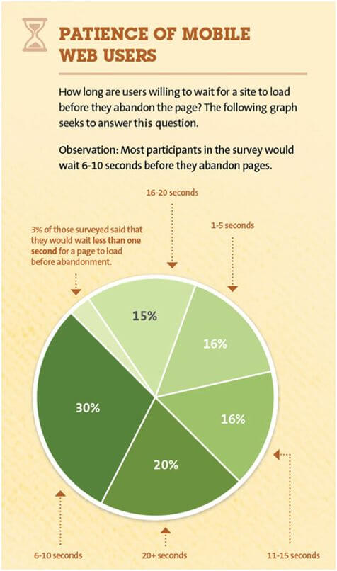
- Surge your site speed. Don’t put your potential customers in the position where they have to choose whether or not they will stick around. The graphic below tells a very simple tale – your customers won’t convert if they’re not there.
Beyond this, page load speed is one of Google’s top ranking factors when it comes to their contemporary indexing strategies. Speeding things up is not an option.
- Remove all obstacles to conversion. The best way to test how easy it is for your customers to convert is to pretend to be one of them. Go through your site as if you know nothing about it, and see where you get tripped up.
- Make payment processing secure, easy and adaptable across a range of platforms.
3. Focus on site navigation
Fun fact — 38% of people will leave a website because they find the layout unattractive. This is a crowd of traffic that nobody can afford to lose. If you don’t make the mobile version of your site as beautiful as its desktop equivalent, your potential customers are not going to stick around.
But layout is not simply how aesthetically pleasing a site is to its users. At the heart of user experience is the ability to find exactly what you’re looking for, when you’re looking for it. This means ensuring that your site has a user-friendly internal site search function. It means focussing on readability of all of your content. It means including pictures that are both optimised for mobile, and help your customers get from A to B.
Here’s the good news and the bad news: mobile optimisation does not have to be difficult, but neither can it be ignored. If you have not begun the process, the time is yesterday.
Before I leave you, I’d like to let you in on a little secret – the tale of how focussing on mobile has helped me and my business.
Mobile and me
My business is a print-on-demand solution called Kite. It’s a robust platform that has helped a range of eCommerce entrepreneurs start and grow successful enterprises. We work in a dynamic industry, driven by technology. Mobile commerce is a key part of this.
Early this year, my team made the wise decision to focus on Google’s shift towards Mobile-first indexing. We increased the speed of our website through a number of technical steps, and implemented a responsive redesign to achieve an optimal mobile performance. Within weeks, it was clear that we were getting and converting more traffic than ever before; across all devices.
The mobile-focused approach also allowed us to confidently send mobile ad traffic to landing pages via social advertising. This shows: adhering to the rules of a Mobile-first Index is just one small part of a shift to mobile-focused content, marketing, sales, and customer service.
SEO is important, but you’re surely using a wealth of channels to drive buyers. Businesses with a mission to grow must take note, and adapt quickly to the mobile-first world.
Charlie Carpenter is the co-founder and CEO of Kite. He is a mobile advocate with over ten years of industry experience.
After working for large and small agencies for many years, he co-founded Kite; a software solution for print-on-demand, zero inventory merchandise, and personalised photo print goods. As well as an entrepreneur, Charlie is a seasoned product strategist with experience of various types of digital projects which include: Responsive and Adaptive Websites, Mobile & Tablet Apps, Hybrid Apps, Cross Platform App development. You can connect with Charlie on LinkedIn, and follow him on Twitter.