
There will be many people within the industry of financial advising that will tell you there is no right way to go about establishing a successful business model. Whether you’re an independent B/D supported at the corporate level or an independent registered investment advisor, no path taken marks a clear road to sustainable success.
This is true for every aspect of the business. Just as there are options for your desired model, there are tips and tricks to help you grow maximize its efficiency. This brings us to the world of internet marketing.
When your company finally reaches that stage of aggressive expansion and it’s necessary to get it out to the public, there are as many ways to reach that targeted traffic as there are to lose them. But with some handy advice and the right disposition, you may find a place to start. Check out these essential tips to start building a proper website to market your financial advisory business.
Table of Contents
Track What Makes Competing Sites Successful
It’s better than nothing. A developing project will often enter the industry with a desire to innovate, to catch a user’s attention with everything that makes them unique. They quickly find that it’s easier thought than said—much less done.
How does the website visualize its content? Through long blocks of text or short, concise phrasing that makes it easier for users to process? Does it have eye-catching images that guide a user’s attention or blaring pop-up advertisements that distract it?
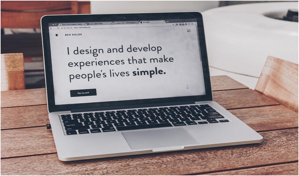
Make Your Platform an Essential Visit

Taking note of working website conventions is only one aspect of optimizing your experience. Knowing what you’re actually going to do to build off of them is another. By building each milestone of your pertinent information directly into the structure of each web page, you will be inviting every user back with the trust in its function to help.
For example, if a potential customer is seeking out the difference between a commission-based compensation model or a fee-based compensation model, what would be the most effective way to provide assistance on your website? Would it be to bog them down with irrelevant information, fluffed-up salesmanship, or forcing them to sign up for a profile they might never use?
There is a broad range of business models that can be followed between investments, insurance, financial planning, and fund management. Combining a succinct explanation for each category into a blob of illegible jargon isn’t going to be as clear.
Instead, try highlighting key terms in bold or italics within their own sub-category. In order to keep users from navigating from your site, it is imperative that it is designed with their interests in mind. Otherwise, it’s more than likely your competitors will see new traffic. Therefore, it’s essential to integrate the best designs of a landing page highlight your websites to engage your audience effectively.
How to Keep a User’s Attention
When designing a website, one crucial aspect that is sometimes overlooked is the distinction between Mobile-Friendly and Responsive Website Design. These two approaches address the challenge of optimizing websites for various devices, particularly mobile devices with smaller screens.
A user shouldn’t be wondering how a website is supposed to work or what links will navigate them to another page. Placing a search bar near the far-right center of the home page does no more favors than hiding the purpose of your firm at the very bottom. Order those aforementioned milestones along an easy-to-follow path.
This can be accomplished with the conservative use of visuals, easily digestible phrases, and immediately identifiable links. It’s important to be wary of elements that can obfuscate the path as well. Long-winded paragraphs and clashing color schemes can strain a user’s attention span as they are forced to work through a site rather than the site working for them. That’s also why it’s imperative for your web page to contain a consistent visual identity.
The Benefit of Effective Visual Communication

There are some simple tips that you can use to send a message on your site without using words. Visuals provide just as much content. A few examples include the proportional layout of the page, different typographies that can highlight otherwise insert text, colors and textures, graphics, videos and animations, and audio cues. All of them tell your story if placed correctly.
It’s important to have an effective organization. To arrange opposing elements in a thoughtful way conveys the human quality of the site. How each building block ascends (or descends, depending on your layout) in relation to each other conveys the overall message of each page. But is it enough to rely on a clever layout? Perhaps not as much if each block doesn’t resemble one another.
There needs to be a routine. Avoid sizing your images one way in certain positions and place them completely differently on another. If there’s a search bar at the top, why would it need to be anywhere else?
Circling back to working conventions, there’s generally an expected format that users have come to be familiar with over years of internet experience. Straying too far from this “external” consistency can also unnecessarily hamper effective communication.
The second guideline principle is economy, or doing the most with the least. If a website has fewer bells and whistles screaming to be noticed, it follows that it will generally be easier to use.
Only show off elements that are critical for the user’s understanding. If a user must know that you deliver fee-based advice under corporate guidance with less chance of financial risk, ensure that it is presented in a direct tone. Only convey exactly what they need to know.
Helpful to this aspect is including distinctive elements that better define your content. Images and graphs can be particularly useful. Do NOT hide information in a sales pitch or a cluttered layout.
Think about the means of communication itself. Take into account the legibility of your text. Don’t overdo it with fancy fonts. Stick to simpler typography and make sure the actual display is easy to decipher. It’s highly recommended that you take extra care to space fonts, indents, and point size properly.
In addition, clarity of color extends not just to the palette chosen. It’s how each color can highlight information. If one core color is chosen to represent a certain tab or graph, similar or identical hues should generally contain the same information.
Color is recommended because it can elicit more of a reaction from the viewer than static black and white. Design isn’t the be-all-end-all of what makes a website tick. That shouldn’t stop you from making yours presentable. Additionally, considering the psychology of color when branding your business can significantly impact how your audience perceives your brand and interacts with your website.
Tapping into User Habits
Let’s face it. Most users don’t visit websites to read through every page available. Usually, they’re hunting for something specific and will look for links that pertain to their search. They don’t want to spend an inordinate amount of time wading through irrelevant information. Oftentimes will never access any other part of the website. That’s not a bad thing.
The website is for the user and a user is not always the same as someone who develops a website. Researching user behaviors and implementing a web structure based on observable patterns may yield greater results.
As stated before, a page should do everything in its power to be more accessible to them so they can find their objective faster. Thus, it’s extremely pertinent that they are presented efficiently and clearly, striving to require as few tabs and clicks as possible. Every available category on the home page should be obvious and emphasized.
This makes it easier for new users to grasp your system too. Anyone unfamiliar with a certain platform shouldn’t get lost coming to yours, even if they are looking for hyper-specific legal information. Barriers to entry, like forcing an account or subscription service, are almost sure-fire ways to lose more traffic than you would gain.
Your aim should be to make your page so simple and convenient that even someone with little knowledge of financial advising would be able to navigate it. After all, helping clients through potentially confusing information is the service you’re trying to provide!
Take the Leap!
There is nothing wrong with attempting to innovate on a website’s standard model. But to improve upon what is already familiar for most users must acknowledge that they aren’t coming to a page for its clever structure. They come because it gives them exactly what they’re looking for.
Remember, don’t put the business before the customer. The website is an extension of the business itself and should be conducted as it would be if the user came to the firm in person. Be helpful. Be direct. Be prepared! Experiment with this advice and not only might you see the traffic you want but more than you ever anticipated!

Gabe Nelson is a content specialist of over 7 years of experience, currently working with theadvisorcoach.com. Just out of high school he set off crab fishing on the Bering sea in Alaska. From there he went back home to finish his college degree at the University of Montana. He has a passion and keen understanding when it comes to financial advising. He has written hundreds of content pieces in numerous niches. Currently, he lives in Missouri with his wife and kids.