


ux mistakes guide illustrationA bad website is – what a surprise! – bad for your business. Visitors decide in seconds whether they want to continue or leave, and most will leave without a second thought if the experience wasn’t what they were expecting, if it has slowed them down, or frustrated them.
The top UX mistakes are usually small enough to escape notice during design but large enough to push away the very people your website was supposed to attract. A checkout button hidden behind a messy clutter, a mobile view that distorts images and site proportions, or navigation that demands a PHD in cartography – each of these will cost you conversions.
In this guide, we’ll explore the most common UX mistakes, real examples, and practical ways to fix them.
After analyzing multiple websites and user behavior patterns, we found that even small UX mistakes can reduce conversions significantly.
The cost isn’t so obvious in a single visit. Yet, over a few weeks and months, the impact will grow. Therefore, here’s what you want to avoid.
What Are UX Mistakes?
UX mistakes are usability and design issues that make it difficult for users to interact with a website effectively.
These mistakes may seem small, but they directly impact user experience, SEO performance, and conversions.
UX focuses on how users feel and interact, while UI focuses on visual design. A website can look good but still perform poorly if the experience is confusing.
Why UX Mistakes Hurt Your Website Performance
UX mistakes don’t just frustrate users—they directly impact business performance.
- Higher bounce rates
- Lower conversions
- Reduced user trust
- Negative SEO signals
For example, a slow-loading or confusing website can push users away within seconds, even if your product is strong.
Top UX Mistakes That Are Costing You Conversions
1. Mobile Inaccessibility (A Critical UX Mistake)
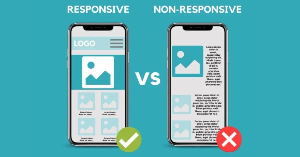
According to Pew Research Center, 98% of Americans own a cellphone of some kind. This number alone should pretty much end any debate about whether mobile access is still optional. A website that loads slowly or displays awkwardly on a smaller screen tells the user, in effect, that their visit wasn’t anticipated. That you’ve built a website without thinking of them.
Conversion rates drop sharply in these conditions because the friction is immediate and impossible to ignore. People will rarely force themselves to work through a poorly formatted mobile experience when they’ve got another, better option one search result away. A design that adapts cleanly to any screen size removes that friction completely.
2. Too Many Pop-ups Disrupt User Experience
Pop-ups can be useful when they’re deployed sparingly. Unfortunately, many websites use them in ways that block people from reaching the information they’re there to get. One appears the moment the page loads, another follows when the cursor moves toward the tab bar, and perhaps a third demands a mailing list signup before content has been consumed.
While each pop-up has a purpose in theory, in practice, they’re disrupting the reading flow and creating a layered barrier between the user and their goal. The irritation appears quickly, and once it has passed a certain threshold, the user’s willingness to continue will collapse. If pop-ups are necessary, they should be limited and relevant, timed to appear only after the user has engaged with the content.
3. Ignoring User Feedback
Negative feedback, while not so pleasant to read, will often contain the clearest roadmap for fixing UX flaws. The users who leave comments or send emails have already done the hard work of identifying pain points. Compared to speculative redesigns, this is gold.
However, this feedback often sits in an ignored inbox or is easily dismissed as the opinions of a few outliers. That dismissal can cost you a lot of conversions. Repeated complaints about slow checkout processes, unreadable text, or broken links point to patterns. Once patterns have become visible, you can measure and fix them. Listening is inexpensive. The absence of listening, on the other hand, will leave the same problems untouched for months or years.
A Real UX Mistake I Made (And How I Fixed It)
One of the biggest UX mistakes I’ve personally experienced was something that didn’t look broken—but was quietly killing conversions.
When I joined SocialChamp as a design lead, the product was solid. All features were working as expected, but the overall experience felt… noisy.
Users were:
- Dropping off in the middle of their journey
- Not exploring key features
- Reaching out to support for things that were already available
Nothing was technically wrong—but something was clearly off.
Here’s what I focused on to fix the experience:
- Mapped user frustration before redesigning the journey
- Removed nearly 30% of unnecessary steps
- Focused on actions instead of visual complexity
- Aligned UX decisions with product goals—not just design trends
- Asked a simple question: “What is the purpose of this screen?”
- Measured drop-offs weekly instead of relying on assumptions
- Involved product managers and support teams early
The result? A smoother user flow, reduced confusion, and improved engagement.
The biggest lesson I learned:
Clean design does not always mean a good user experience.
A good experience is one that helps users achieve their goals with minimal friction.
UX is not just about design—it’s about clarity, intent, and outcomes.
4. Cluttered Design and Confusing Navigation
Nobody likes a website that resembles a tax form. Yes, we’re talking about overdesigning your website, one of the top UX mistakes. It shows itself in too many menu options, dense blocks of text, an overload of visual elements competing for attention, etc. Users faced with this have to decide where to place their focus. Eventually, many will choose to focus elsewhere, i.e., on a different website.
Streamlining doesn’t mean stripping away necessary content. You’ve got to present the essential information in a way that can be absorbed without effort. Clear hierarchy, concise copy, and visual breathing room will let the design guide the eye naturally. The fewer decisions a user has to make to complete an action, the better the experience they’ll have.

5. No UX Testing or Data-Driven Decisions
Designers and developers might rely on assumptions about what users want or how they behave. That’s okay. However, without testing, they won’t get to test their hypotheses. That’s not okay. A/B testing has the power to turn vague assumptions and guesses into clear data you can act upon. Heatmaps will show you where users hesitate. Session recordings will reveal where they abandon forms or miss calls to action.
Skipping testing means leaving these insights undiscovered, and the same conversion barriers remain in place. Regular testing, even in small iterations, gives a feedback loop that can be acted on immediately. It is the difference between a site built on theory and one refined through direct evidence.
6. Prioritizing SEO Over User Experience
SEO can bring visitors, yes, but it won’t keep them if the site reads and functions for algorithms rather than people. Search visibility has value only when paired with an experience that feels coherent and trustworthy to a human audience. That includes legible typography, logical content structure, and a tone that respects the reader’s time. A visitor who finds value will stay, explore, and act – the exact outcome SEO is meant to support.
Here’s an example. A blog post might rank highly just because it sports a keyword repeated dozens of times. But, if the paragraphs appear to be bloated, or if the headings are deemed irrelevant, or if the page’s crowded with ads that block the content and only frustrate users, most of them will exit within seconds.
7. Slow Page Load Speed
A slow-loading website is one of the most damaging UX mistakes—and users won’t wait around to give you a second chance.
When a page takes too long to load, frustration builds instantly. It doesn’t matter how good your design or content is; if users can’t access it quickly, they’ll leave. Most users expect a website to load within a few seconds, and anything beyond that creates unnecessary friction.
This issue often comes from unoptimized images, heavy scripts, or poor hosting performance. Over time, even a slight delay can lead to a significant drop in conversions and engagement.
Improving page speed isn’t just a technical fix—it’s a direct improvement in user experience. A fast-loading site keeps users engaged, reduces bounce rates, and increases the chances of conversions.
8. Weak Call-to-Action (CTA)
Even if your website attracts visitors, a weak or unclear call-to-action can stop them from taking the next step.
Users need direction. Without a clear CTA, they’re left wondering what to do next—whether it’s signing up, making a purchase, or contacting you. If your CTA is hidden, poorly worded, or blends into the design, it will be ignored.
Common mistakes include:
- Using vague text like “Click Here”
- Placing CTAs where users don’t notice them
- Overloading pages with too many competing actions
A strong CTA should be clear, visible, and action-oriented. Phrases like “Get Started,” “Submit Now,” or “Download Free Guide” give users a clear path forward.
A well-placed CTA can significantly improve conversions because it removes confusion and guides users toward a specific goal.
9. Poor Readability
If users struggle to read your content, they won’t stay long enough to understand it.
Poor readability is a subtle but powerful UX mistake. It includes small font sizes, long unbroken paragraphs, low contrast between text and background, and inconsistent formatting. These issues force users to work harder than they should, which often leads to frustration and quick exits.
Online users typically scan content rather than read every word. If your content isn’t structured properly—with headings, spacing, and clear sections—it becomes difficult to consume.
Improving readability is simple but effective:
- Use short paragraphs
- Add headings and subheadings
- Maintain proper spacing
- Choose readable fonts and contrast
When content is easy to read, users stay longer, engage more, and are more likely to take action.
10. No Clear User Flow
One of the biggest UX mistakes is not guiding users through a clear journey.
When users land on your website, they should immediately understand what to do next. Without a clear flow, they move randomly—or worse, leave without taking any action.
A lack of user flow often results in:
- Confusion about next steps
- Abandoned forms or processes
- Missed conversion opportunities
Every page should have a purpose and a logical path. For example, a visitor might land on a blog, move to a service page, and then complete a form. If that journey isn’t clear, users get lost.
A strong user flow removes decision fatigue and creates a seamless experience. It ensures that users move naturally from one step to the next, increasing engagement and conversions.
If you’re facing similar UX issues, it’s time to audit your website experience.
How to Fix UX Mistakes
Identifying UX mistakes is only the first step. The real impact comes from fixing them in a structured and consistent way.
Start by performing a UX audit of your website. Analyze how users interact with your pages, where they drop off, and which areas create confusion. Tools like heatmaps and session recordings can help you understand real user behavior.
Next, simplify your navigation. Make sure users can easily find what they’re looking for without unnecessary clicks. A clear and logical structure reduces frustration and improves engagement.
Improving page speed should also be a priority. Optimize images, reduce heavy scripts, and use caching to ensure your site loads quickly across all devices.
Testing user behavior is equally important. Instead of relying on assumptions, use A/B testing to validate changes. Even small adjustments can lead to noticeable improvements in conversions.
Finally, treat UX as an ongoing process. Continuously monitor performance, gather feedback, and refine your website to keep improving the overall experience.
UX Best Practices You Should Follow
A well-designed user experience is built on consistency, clarity, and simplicity. Following these best practices can help you avoid common UX mistakes and create a better experience for your users.
Keep your design simple and focused. Avoid unnecessary elements that distract users from their main goal. A clean layout helps users navigate your website effortlessly.
Always focus on user goals. Every page should have a clear purpose and guide users toward a specific action. Understanding user intent is key to delivering a meaningful experience.
Maintain consistency across your website. Use similar fonts, colors, and layouts so users feel familiar as they move from one page to another.
Optimize for mobile-first experiences. Since most users browse on mobile devices, your design should adapt seamlessly to smaller screens.
Reduce friction wherever possible. Minimize steps, simplify forms, and remove anything that slows users down. A frictionless experience leads to higher engagement and conversions.
UX Mistakes Checklist
Use this quick checklist to identify and fix common UX issues on your website:
✔ Is your website mobile-friendly and responsive?
✔ Does your site load quickly on all devices?
✔ Is your navigation clear and easy to use?
✔ Are your call-to-actions visible and effective?
✔ Is your design clean and free from clutter?
✔ Is your content easy to read and scan?
✔ Do users have a clear path to follow?
If you answer “no” to any of these, there’s an opportunity to improve your user experience.
FAQs
What are UX mistakes?
UX mistakes are usability and design issues that make it difficult for users to interact with a website effectively, leading to lower engagement and conversions.
How do UX mistakes affect conversions?
UX mistakes create friction, confuse users, and reduce trust, which prevents visitors from completing actions like signing up or making a purchase.
What is the biggest UX mistake?
One of the biggest UX mistakes is poor navigation and lack of a clear user flow, which makes it hard for users to find what they need.
How can I fix UX mistakes?
You can fix UX mistakes by performing UX audits, simplifying navigation, improving speed, and continuously testing user behavior.
Why is UX important for SEO?
Good UX improves user engagement, reduces bounce rate, and sends positive signals to search engines, which can improve rankings.
The Details (Will) Decide
Small choices in design and functionality decide whether visitors become customers or vanish; whether your business will grow. The top UX mistakes rarely involve a single catastrophic flaw. Instead, you’re dealing with a collection of overlooked details. And to keep those details in check, you’ve got to treat UX as an ongoing process rather than a one-time project.
Each unnoticed friction point is like a loose thread in fabric: pull it just right, and the whole experience unravels – or, if caught early, the web of connections stays intact, holding visitors close instead of letting them slip away.
Improving UX is not a one-time task—it’s an ongoing process.
If you want to improve your website’s performance, start identifying and fixing these UX mistakes today.
Conclusion
UX is not just about design—it’s about how users interact with your website and how easily they can achieve their goals.
Even small UX mistakes can have a significant impact on conversions, user engagement, and overall business growth. The key is to identify these issues early and continuously improve your website experience.
Improving UX is not a one-time task—it’s an ongoing process that requires testing, learning, and refining.
If you want to improve your website’s performance, start identifying and fixing these UX mistakes today. Small changes can lead to big results over time.

Charlie Woods is a digital marketing professional at Movers Development, a company that helps moving businesses grow through SEO, PPC, web design, and targeted online strategies. He specializes in topics like UX, web design, and conversion optimization, sharing practical tips for improving online performance. In his free time, Charlie enjoys reading, experimenting with new design ideas, and traveling to find inspiration.